Create cool custom bullet points with CSS
Lists are a great way to showcase structured data. To make them look even fancier you can introduce a custom bullet points with pure CSS.
There are quite a few ways to make lists in HTML. But in this article I’m going to focus mainly on unordered list, as they’re more often requires appearance customization.
Contents:
Defaults
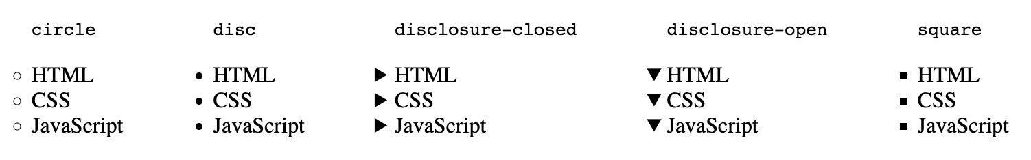
By default bullet points are displayed for unordered lists - ul tag. Usually they are in a circle shape. But you can set some predefined values to change their appearance.
Use a list-style-type property with one of the following values:
- circle
- disc (this is often a default appearance)
- disclosure-closed
- disclosure-open
- square
All of the values are self explanatory. You can always make a quick experiment inside the Dev Tools.
Images
You can also set the image to appear as the bullet point with the list-style-image property.
ul {
  list-style-image: url('double-caret-right.png');
}
Result:
- HTML
- CSS
- JavaScript
However list-style-type and list-style-image has its own limitations. You cannot control the size or the color of the bullets.
Pseudo element
To make an even more fancy appearance of the bullet points you can use pseudo-elements.
before and after
The traditional way to do so is to declare a before pseudo-element on a li tag.
ul li::before {
  content: '🔹';
}
Result:
- HTML
- CSS
- JavaScript
The best part is that now you can control different properties of the bullet point. Like content, size, color, position.
For content you can use emojies, special characters (html entities, and fonts.
Since content is interpreted as text, you can set font related rules like font-size, color, line-height and etc.
ul li::before {
  content: '✔';
  font-size: 15px;
  color: limegreen;
  line-height: 1.7;
  padding-right: 10px;
}
Result:
- HTML
- CSS
- JavaScript
Another way to customize your bullet points is to set images as a background, this works well for SVG type images. You can even set an SVG image as an encoded piece of code, meaning no file needed.
The benefit of this approach is that unlike list-style-image property you can control image size and position.
ul li {
  position: relative;
}

ul li:before {
  content: '';
  position: absolute;
  left: 23px;
  top: 6px;
  width: 15px;
  height: 15px;
  background: url("data:image/svg+xml,%3Csvg xmlns='http://www.w3.org/2000/svg' xmlns:xlink='http://www.w3.org/1999/xlink' version='1.1' x='0px' y='0px' viewBox='0 0 426.667 426.667' style='enable-background:new 0 0 426.667 426.667;' xml:space='preserve'%3E%3Cg%3E%3Cg%3E%3Cg%3E%3Cpath d='M213.333,106.667c-58.88,0-106.667,47.787-106.667,106.667S154.453,320,213.333,320S320,272.213,320,213.333 S272.213,106.667,213.333,106.667z' fill='gold'/%3E%3Cpath d='M213.333,0C95.467,0,0,95.467,0,213.333s95.467,213.333,213.333,213.333S426.667,331.2,426.667,213.333 S331.2,0,213.333,0z M213.333,384c-94.293,0-170.667-76.373-170.667-170.667S119.04,42.667,213.333,42.667 S384,119.04,384,213.333S307.627,384,213.333,384z' fill='gold'/%3E%3C/g%3E%3C/g%3E%3C/g%3E%3C/svg%3E");
}
Result:
- HTML
- CSS
- JavaScript
marker
A modern and a semantic way to customize your bullet points is to use marker pseudo-element. It selects a marker box of a list item, that way you have before and after pseudo-elements saved for later usage.
It acts the same way as before and after pseudo elements. You can set the content property for custom bullet type. And then use font related rules to set the appearance of the bullet, color, font-size, etc.
ul li::marker {
  content: '✅ ';
  font-size: 15px;
}
Result:
- HTML
- CSS
- JavaScript
For list styling it is recommended use the marker pseudo-element it is supported by all modern browsers.

Counter style rule
Finally, you can use the @counter-style CSS at-rule that lets you extend default list styles and define your own counter styles.
@counter-style circled-nums {
  system: fixed;
  symbols: ➊ ➋ ➌ ➍ ➎ ➏ ➐ ➑ ➒ ➓;
  suffix: " ";
}

.circled-nums {
  list-style: circled-nums;
}
Result:
- HTML
- CSS
- JavaScript
- PHP
- SQL
@counter-style new-style {
  system: extends decimal;
  suffix: ") ";
  prefix: "(";
}
ol {
  font-size: 30px;
  list-style-type: new-style;
  list-style-position: inside;
}
Result:
- HTML
- CSS
- JavaScript
However, the @counter-style rule is currently lacking full browser support. But it’s good to know that such a rule exists and explore its possibilities.
Data on support for the mdn-css__at-rules__counter-style feature across the major browsers