How to adjust the element's inner border radius
An element’s inner border-radius is the value a developer cannot directly affect. However, some tricks can be implemented in order to achieve the same smooth border curve result.
The element’s inner border-radius is formed via formula:
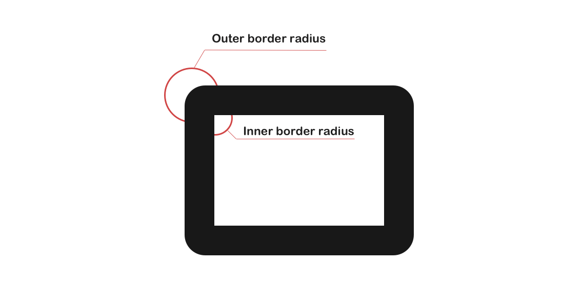
IBR: Inner Border Radius
OBR: Outer Border Radius
BW: Border Width

IBR = OBR - BW
The padding edge (inner border) radius is the outer border radius minus the corresponding border thickness.
—Corner Shaping


Therefore there might be cases when the inner border-radius will differ from the outer one. Usually, this will happen when the border-width is greater than the border-radius, this will result in a right angle.
Luckily if you know how the inner border-radius is formed, you can apply certain changes that will help you to smooth out the looks of the inner border-radius.
There are a few ways to achieve that. Let’s say there’s an element with some content inside it.
HTML:
<div class="content">
  Lorem ipsum dolor sit amet consectetur adipisicing elit.
</div>
CSS:
.content {
  border: 13px solid #333;
  border-radius: 10px;
}
Result:
1. Add a box-shadow property
For this trick, the border property must be removed and box-shadow must be added instead.
HTML:
<div class="content">
  Lorem ipsum dolor sit amet consectetur adipisicing elit.
</div>
CSS:
.content {
  box-shadow: 0 0 0 13px #333;
  border-radius: 10px;
}
Result:
NOTE: box-shadow property goes outside the element’s box model, this means that the element might get larger in size.
2. Add a container for content
Although the box-shadow gets the job done it is a bit hacky fix. Another more proper way to fix it is to add a wrapper for the content and set the border-radius property for it.
The value should be equal to a CSS calc() function. The parameter for this function should be the expression based on the formula given above.
To actually make the inner border-radius effect a background property with a value equal to the border color must be set to the .content element.
For the p element, a background property must be set as well.
HTML:
<div class="content">
  <p>Lorem ipsum dolor sit amet consectetur adipisicing elit.</p>
</div>
CSS:
.content {
  border: 13px solid #333;
  border-radius: 10px;
  background: #333;
}

.content p {
  border-radius: calc(13px - 10px);
  background: #fff;
  margin: 0;
}
Result:
Lorem ipsum dolor sit amet consectetur adipisicing elit.
What about gradient?
If you wish to use a gradient for your border then you should set a background property for the .content with linear-gradient as the border-color and the padding property as the border-width.
CSS:
.content {
  border-radius: 10px;
  background: linear-gradient(45deg, purple, orange);
  padding: 10px;
}

.content p {
  border-radius: calc(13px - 10px);
  background: #fff;
  margin: 0;
}
Result:
Lorem ipsum dolor sit amet consectetur adipisicing elit.