Modern button styles in web design
The modern world of web design and UI is dominated by Material and Flat design trends.
This statement also applies to button elements on a webpage. And I’m talking about buttons, not menu items, various controls, links, icons, etc.
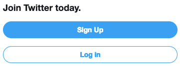
Keeping this in mind, if you think about it, there are 6 main style types of buttons in web design. You can split them into 2 categories: filled and outlined. Each category have 3 basic shapes: square, rounded and round.
Filled buttons
Outlined buttons
Of course there are exceptions and you may find some bizarre and fancy buttons out there. Also there may be countless modifications to the original ones with all the effects and transitions CSS has to offer these days. But at the end of the day all of these fancy styled buttons are based on these 6 main button style types.
Below are some of the most famous services and resources putting these principles into practice.


Check out these awesome buttons on Codepen and notice that most of them uses the same kind of design princilpes.
This article on Medium describes the 7 rules for button design. And even there you can find the pattern in advices given.
To conclude, there is no actual point in this article, just an observation I’ve noticed and found it interesting, so I decided to share it with you.
