Aspect ratio with CSS aka the padding hack
When working with media whether it’s an image or a video, sometimes you have to preserve its initial proportions (aspect ratio). In this guide, I’ll try to explain how exactly you can achieve such a result with CSS.
What is the aspect ratio?
Usually, when talking about an aspect ratio it implies a display or a screen. It’s a ratio of width to height.
Most popular are 16:9 (standard for HDTV) and 4:3 (standard TV). So for the 16:9 aspect ratio, it means that the ratio is 16 units of width to 9 units of height.
In order to implement aspect ratio in CSS, you can go either with
aspect-ratioproperty- the so-called “padding hack”
The CSS aspect-ratio property
CSS has an aspect-ratio property that can be used natively to avoid the “padding hack”.
This property does essentialy what you’d expect it to do, apply aspect ratio to an element.
So instead of the padding-top property you can use the aspect-ratio.
Example:
.aspect-ratio-container {
  aspect-ratio: 16 / 9;
}
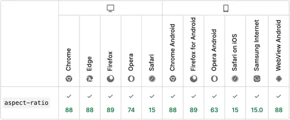
The aspect-ratio property is supported by all modern browsers:
Padding hack
This means that a padding-top or padding-bottom property must be set on an element with the calculated percentage value that represents the aspect ratio.
In order to calculate the value for the padding property, you’ll need to make a division of the ratio values and multiply it by 100%.
E.g.:
- 16:9 aspect ratio will result in
9 / 16 * 100% = 56.25%; - 4:3 aspect ratio will result in
3 / 4 * 100% = 75%; - 1:1 aspect ratio will result in
1 / 1 * 100% = 100%.
So to apply it for a div element:
.aspect-ratio--16-9 {
  overflow: hidden;
  padding-top: 56.25%;
  background-image: linear-gradient(45deg, #7f14c1, #80fbfb);
}
The resulted element below will now always maintain the 16:9 aspect ratio no matter the screen size:
Use cases
Images
Images comes with a fixed size thus fixed aspect ratio. Consider following image, its size is 1920x1585.

If you change its width or height to match the desired aspect ratio, the image will become skewed as it has a fixed aspect ratio.
However, you can set the image as a background for a div container, and provide the container with an aspect ratio.
.aspect-ratio--16-9 {
  overflow: hidden;
  padding-top: 56.25%;
  background: url('city-skyline.jpg') no-repeat center;
  background-size: cover;
}
The image will lose its initial size but will take up the remaining space evenly and maintain the aspect ratio.
💡 NOTE: Setting an image as a background is not a good practice to display an image as it is not friendly to assistive technologies. The background image should be set only for decorative purposes.
Result:
Videos
Videos are another media format that requires proper styling on a page in order to have a more appealing display.
Today the standard video aspect ratio is 16:9 (recommended by YouTube and Vimeo).
You can use aspect ratio to create container of any size, and then scale the video to full-size of it.
To give your video an aspect ratio we’ll use the “padding hack” along with some other properties.
The markup consists of a container div and a video element inside it and will look as follows:
<div class="video-container">
  <video class="video" src="runner.mp4" controls />
</div>
The container will have a padding-top property for the aspect ratio. The video element has to have position: absolute in order to fit inside the container. Also the object-fit: cover and the height: 100% properties have to be applied in order for the video element to fill up the empty space.
.video-container {
  position: relative;
  padding-top: 56.25%;
}

.video {
  position: absolute;
  top: 0;
  left:0;
  width: 100%;
  height: 100%;
  object-fit: cover;
}
Result:
Video by Coverr-Free-Footage from Pixabay
Embeds
Embeds are a popular way to include images and videos from a 3rd party websites, like Vimeo for videos or Pinterest for images. Embed is an iframe element. In this case to give an iframe an aspect ratio, we can use the same approach as for videos.
In the example below let’s embed a Vimeo video. Markup:
<div class="embed-container">
  <iframe class="embed-vimeo" src="https://player.vimeo.com/video/82931517" width="640" height="360" frameborder="0" allow="autoplay; fullscreen; picture-in-picture" allowfullscreen></iframe>
</div>
<p>
  <a href="https://vimeo.com/82931517">Light Goes On</a> from <a href="https://vimeo.com/dariustwin">Darren Pearson</a> on <a href="https://vimeo.com">Vimeo</a>.
</p>
CSS will be the same as for video:
.embed-container {
  position: relative;
  padding-top: 56.25%;
}

.embed-vimeo {
  position: absolute;
  top: 0;
  left:0;
  width: 100%;
  height: 100%;
  object-fit: cover;
}
Result:
Light Goes On from Darren Pearson on Vimeo.
Conclusion
A modern way to apply aspect ratio to an element is to use the aspect-ratio CSS property.
It’s good to know about the “padding-hack” approach as well. You may still encounter it somewhere, as it was heavily used, prior to aspect-ratio property.
“Padding hack” works across all browsers, even old ones. So if you’re working on a project and you need to maintain older browsers, the “padding-hack” is your go to way.