Custom styled input type file upload button with pure CSS
In this guide I’ll show you how to create a stylish and user friendly file upload button with pure CSS and HTML.
Markup
To upload files you’ll need to use the input tag with type="file" attribute. Additionally you can specify which file types you’re allowing to upload via accept attribute.
HTML:
<input type="file" accept="image/*">
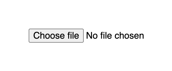
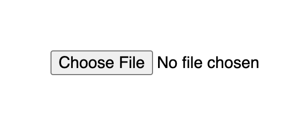
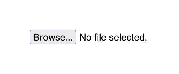
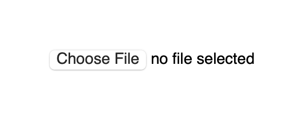
This markup produces a button with a Choose file title followed by a text which indicates the file name when selected. By default it is No file chosen.
Result:
Input with type file default look differs on different browsers:
Styling
The upload file widget structure consists of a block that displays a button and a file name. A user can click anywhere inside the block or drag a file from the desktop and it will open up the upload window.
Styling the upload file block
If you apply styles for the input[type=file] selector it will set them for the whole widget block, that is the button and text.
CSS:
input[type=file] {
  width: 350px;
  max-width: 100%;
  color: #444;
  padding: 5px;
  background: #fff;
  border-radius: 10px;
  border: 1px solid #555;
}
The result already looks much better as it indicates the zone where user is able to click or drag the file.
Result:
Styling the upload file button
By default, the Choose file button has a plain user-agent style. To style the button with CSS you should use the ::file-selector-button pseudo-element to select it. It is supported in all modern browsers.
CSS:
input[type=file]::file-selector-button {
  margin-right: 20px;
  border: none;
  background: #084cdf;
  padding: 10px 20px;
  border-radius: 10px;
  color: #fff;
  cursor: pointer;
  transition: background .2s ease-in-out;
}

input[type=file]::file-selector-button:hover {
  background: #0d45a5;
}
Result
Styling the the click/drop zone
If you wich to go a bit further, you can create a large zone where user can click and drag files. This large zone will make it easier for people to use the widget, as it don’t require to be that precise when dragging a file, especially on smaller screens.
To implement a large drop zone, you’ll need to wrap your file upload input into a label tag and specify a description text that will let users know how to use the widget.
HTML
<label for="images" class="drop-container" id="dropcontainer">
  <span class="drop-title">Drop files here</span>
  or
  <input type="file" id="images" accept="image/*" required>
</label>
For the layout, we need to set display to flex with flex related properties for positioning. The height and padding properties for proportion. And finally add some fancy styles like border and hover effects to highlight the file upload zone and you’re ready to go.
CSS:
.drop-container {
  position: relative;
  display: flex;
  gap: 10px;
  flex-direction: column;
  justify-content: center;
  align-items: center;
  height: 200px;
  padding: 20px;
  border-radius: 10px;
  border: 2px dashed #555;
  color: #444;
  cursor: pointer;
  transition: background .2s ease-in-out, border .2s ease-in-out;
}

.drop-container:hover {
  background: #eee;
  border-color: #111;
}

.drop-container:hover .drop-title {
  color: #222;
}

.drop-title {
  color: #444;
  font-size: 20px;
  font-weight: bold;
  text-align: center;
  transition: color .2s ease-in-out;
}
Result:
Handling drag and drop events
Additionally, you can handle cases when the user will try to drag the file over the drop area. CSS alone cannot handle such cases, so we can add a little bit of JavaScript.
There are two points to consider to improve UX for the drop field:
- Indicate the drop area when the user is dragging a file over it
- Make it possible to drop a file inside the drop area, and not just the
inputelement
To indicate drop area when user is dragging a file over it, we’ll need to use the dragenter and dragleave events. Both on the label tag, since it represents the drop area. For each event we add or remove a CSS class accordingly.
Since user will be dropping to the label tag we also need to set the input value with the file. To do that we need to do 2 things:
- Set
dragoverevent for thelabeltag, sete.preventDefault()and passfalseas the third parameter for theaddEventListenermethod - On
dropevent, we need to set the input’sfilesproperty to the file viafileInput.files = e.dataTransfer.files
  const dropContainer = document.getElementById("dropcontainer")
  const fileInput = document.getElementById("images")

  dropContainer.addEventListener("dragover", (e) => {
    // prevent default to allow drop
    e.preventDefault()
  }, false)

  dropContainer.addEventListener("dragenter", () => {
    dropContainer.classList.add("drag-active")
  })

  dropContainer.addEventListener("dragleave", () => {
    dropContainer.classList.remove("drag-active")
  })

  dropContainer.addEventListener("drop", (e) => {
    e.preventDefault()
    dropContainer.classList.remove("drag-active")
    fileInput.files = e.dataTransfer.files
  })
As for styles, we can use similar styles to :hover state, but this time with a designated class:
.drop-container.drag-active {
  background: #eee;
  border-color: #111;
}

.drop-container.drag-active .drop-title {
  color: #222;
}
Result:
Demo
See the full example on CodePen:
See the Pen Untitled by Nikita Hlopov (@nikitahl) on CodePen.