Styling range input with CSS and JavaScript for better UX
To style the range input with CSS you’ll need to apply styles to two pseudo-elements: ::-webkit-slider-thumb and ::-webkit-slider-runnable-track. Find out how you can apply custom styling and make the range input more functional and appealing.
Contents of the article:
- Accent color
- CSS selectors for the range input
- Improving usability
- A sprinkle of JavaScript
- Range input for RTL direction
- Demo
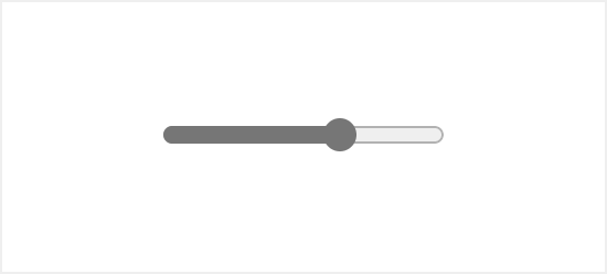
The input element with a type of range is a native HTML form UI element that allows users to select a value by dragging a slider over a range field.
The default browser styling for this element is very basic and doesn’t provide enough information to the user which might confuse one. Also, the appearance of the range input element is different across browsers.
Range input HTML:
<input type="range">
Result:
Range input appearance on different browsers:
Luckily there are ways you can improve that using nothing but native CSS and JavaScript.
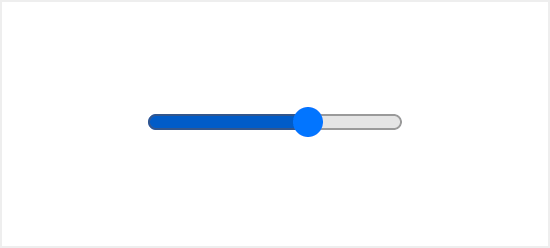
Accent color
One simple way to customize the appearance of the range input without any specific selectors or additional HTML is to change the color of the range.
To do so you can define the accent-color property for the input[type="range"] selector which will update the color of the track and thumb.
input[type="range"] {
  accent-color: coral;
}
Result:
CSS selectors for the range input
The range input widget consists of two parts the thumb and the track. Each one of these parts has its own pseudo-class selector for styling with a vendor suffix for cross-browser support.
Thumb:
input[type="range"]::-webkit-slider-thumb
input[type="range"]::-moz-range-thumb
input[type="range"]::-ms-thumb
Track:
input[type="range"]::-webkit-slider-runnable-track
input[type="range"]::-moz-range-track
input[type="range"]::-ms-track
input[type="range"] {
  -webkit-appearance: none;
  margin-right: 15px;
  width: 200px;
  height: 7px;
  background: rgba(255, 255, 255, 0.6);
  border-radius: 5px;
  background-image: linear-gradient(#ff4500, #ff4500);
  background-size: 70% 100%;
  background-repeat: no-repeat;
}

input[type="range"]::-webkit-slider-thumb {
  -webkit-appearance: none;
  height: 20px;
  width: 20px;
  border-radius: 50%;
  background: #ff4500;
  cursor: ew-resize;
  box-shadow: 0 0 2px 0 #555;
  transition: background .3s ease-in-out;
}

input[type=range]::-webkit-slider-runnable-track  {
  -webkit-appearance: none;
  box-shadow: none;
  border: none;
  background: transparent;
}
To indicate the selected value, we can add a color from the start of the track up until the thumb. To do that we can use the background-image property with the linear-gradient() value. The background-size property will be used to set the size, which can later be updated with JavaScript.
Improving usability
The default range input doesn’t specify any values selected. Which makes it hard for users to understand what value is currently selected.
While the hash marks and labels on the range input are a great way to aid users visually, this feature is yet to become available.
However, there are a few ways you can improve that with some additional HTML and JavaScript:
- Specify the output element to display the selected value
- Specify the number input that is synced to the range input
Specify the output element to display the selected value
The output element on the side of the range input will display the selected value. You’ll have to add an id attribute for the output element, and an oninput attribute for the range input with a short function as a value, that will update the output element contents.
<input type="range" min="0" max="100" oninput="rangevalue.value=value"/>
<output id="rangevalue">50</output>
Specify the number input that is synced to the range input
To take it a step further you can add a number input next to the range element.
That way the user will see the selected value and will have an option to modify it via the number input, which can be a better experience especially for mobile users.
<input type="range" value="50" min="0" max="100" id="range" oninput="rangevalue.value=value"/>
<input type="number" id="rangevalue" value="50" oninput="range.value=value">
A sprinkle of JavaScript
To finalize we’ll need some JavaScript code to make it all work. The oninput attribute is already updating value based on a target element.
But to update the selected area of the range input we need to calculate the ratio and apply that value to the input background-size property.
💡 NOTE: the value property of the range input is a string type, if you want to use is as a numeric value you should use valueAsNumber property.
const rangeInputs = document.querySelectorAll('input[type="range"]')
const numberInput = document.querySelector('input[type="number"]')

function handleInputChange(e) {
  let target = e.target
  if (e.target.type !== 'range') {
    target = document.getElementById('range')
  }
  const min = target.min
  const max = target.max
  const val = target.value

  target.style.backgroundSize = (val - min) * 100 / (max - min) + '% 100%'
}

rangeInputs.forEach(input => {
  input.addEventListener('input', handleInputChange)
})

numberInput.addEventListener('input', handleInputChange)
Range input for RTL direction
To make the above solution of custom range input work for RTL (right to left) web pages, you must make some adjustments for both CSS and JavaScript.
The recommended way to set the text direction of a block or a whole page is to use the dir attribute.
<html dir="rtl">
  ...
</html>
Once the dir attribute is set, we can specify the following selector for the range input [dir="rtl"] input[type="range"].
Now to set the same value for the RTL direction, we must revet the background colors and the value. So for the 70% range, it will look as follows:
[dir="rtl"] input[type="range"] {
  /* Used to be gradient color, the current progress */
  background: #ff4500;

  /* Used to be background color, the track */
  background-image: linear-gradient(#fff, #fff);

  /* 30% is the difference between the max and the current value (100 - 70) */
  background-size: 30% 100%;
  background-repeat: no-repeat;
}
As for the JavaScript, we need to add a condition for the change handler function, to calculate the correct value: max - current.
function handleInputChange(e) {
  let target = e.target
  if (e.target.type !== 'range') {
    target = document.getElementById('range')
  }
  const min = target.min
  const max = target.max
  const val = target.value
  let percentage = (val - min) * 100 / (max - min)

  // condition to check whether the document has RTL direction
  // you can move it to a variable, if document direction is dynamic
  if (document.documentElement.dir === 'rtl') {
    percentage = (max - val)
  }

  target.style.backgroundSize = percentage + '% 100%'
}
Custom range input Demo
You can find a full demo with a complete code examples on CodePen:
See the Pen Range Input with values (Pure HTML, CSS, JS) by Tippingpoint Dev (@tippingpointdev) on CodePen.