Guide to creating CSS only tooltip with an arrow
Tooltip is a nice way to display additional information when there isn’t much space for it. You can create beautiful tooltips using only CSS.
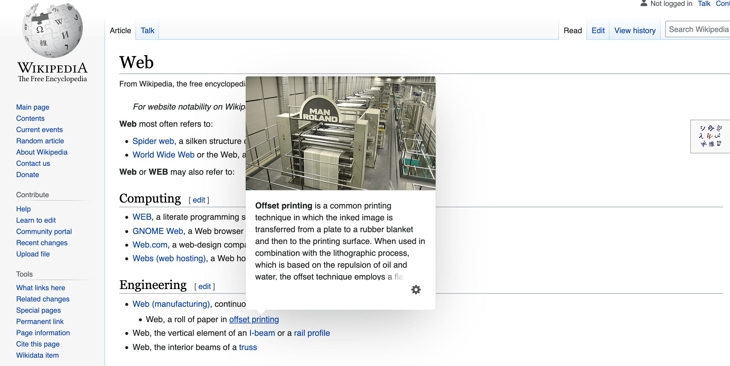
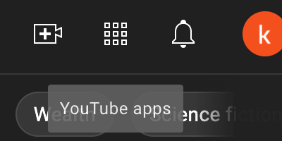
Usually, tooltips are shown on hover state. Below you can see tooltip examples from some of the most popular apps and websites:


NOTE: By default, HTML provides a way to show native tooltip using the title attribute. The tooltip will appear with a slight delay when the user hovers over an element with the title attribute.

Creating a tooltip
Say we have an abbr element and we want to display a nice looking tooltip for it, to let users know what it means:
<abbr>HTML</abbr>
Before we move any further, we need to tweak the existing HTML a bit.
We’ll add a tooltip class to select it and apply styles via CSS and add the data-tooltip attribute that holds the actual tooltip value, so it looks as follows:
<abbr class="tooltip" data-tooltip="HyperText Markup Language">HTML</abbr>
To create a tooltip with only CSS, we’ll need to use the pseudo-element. The pseudo-element has a content attribute that can store its value. We can pass a text, that will be used to display tooltip info.
content: "HyperText Markup Language";
To reuse the tooltip component for multiple elements, the pseudo-element content attribute can have an attr() value linked to the element’s HTML attribute.
content: attr(data-tooltip);
Styling the tooltip
First, we need to set the position rule for the tooltip class. That way we can properly position our tooltip later. Also, we can add a dotted underline (abbr tag already has it by default in some browsers) and a help cursor, to indicate that additional information is available.
.tooltip {
  position: relative;
  text-decoration: underline dotted;
  cursor: help;
}
The pseudo-element will look as follows:
.tooltip::before {
  content: attr(data-tooltip);
  position: absolute;
  bottom: 100%;
  left: 50%;
  transform: translate(-50%);
  margin-bottom: 15px;
  color: #fff;
  background: rgba(0,0,0, .7);
  border-radius: 5px;
  padding: 5px;
}
Tooltip arrow
To create the tooltip arrow, we can use the triangle shape made out of the second pseudo-element border.
.tooltip::after {
  position: absolute;
  content: "";
  width: 0;
  height: 0;
  border-left: 5px solid transparent;
  border-right: 5px solid transparent;
  border-top: 7px solid rgba(0,0,0, .7);
}
Animating the tooltip
For more appealing interaction we can animate the tooltip by adding a small transition. By adding a zero opacity and a transition property for both pseudo-elements, on hover, we can fade-in tooltip by setting opacity to 0.
.tooltip::before,
.tooltip::after {
  opacity: 0;
  visibility: hidden;
  transition: opacity .3s ease-in-out;
}

.tooltip:hover::before,
.tooltip:hover::after {
  opacity: 1;
  visibility: visible;
}
Positioning the tooltip
The provided example will create a tooltip above the element. However, that’s not always the case. You may want to display your tooltip below, left, or right of an element.
For that reason, we can create modification classes (using BEM principle). So in total, we’ll have four additional classes to set tooltip position:
tooltip--toptooltip--bottomtooltip--lefttooltip--right
.tooltip--top::before,
.tooltip--top::after {
  bottom: 100%;
  left: 50%;
  transform: translate(-50%);
  margin-bottom: 15px;
}

.tooltip--top::after {
  margin-bottom: 8px;
  border-left: 5px solid transparent;
  border-right: 5px solid transparent;
  border-top: 7px solid rgba(0,0,0, .7);
}

.tooltip--bottom::before,
.tooltip--bottom::after {
  top: 100%;
  left: 50%;
  transform: translate(-50%);
  margin-top: 15px;
}

.tooltip--bottom::after {
  margin-top: 8px;
  border-left: 5px solid transparent;
  border-right: 5px solid transparent;
  border-bottom: 7px solid rgba(0,0,0, .7);
}

.tooltip--right::before,
.tooltip--right::after {
  top: 50%;
  left: 100%;
  transform: translate(0, -50%);
  margin-left: 15px;
}

.tooltip--right::after {
  margin-left: 8px;
  border-top: 5px solid transparent;
  border-right: 7px solid rgba(0,0,0, .7);
  border-bottom: 5px solid transparent;
}

.tooltip--left::before,
.tooltip--left::after {
  top: 50%;
  right: 100%;
  transform: translate(0, -50%);
  margin-right: 15px;
}

.tooltip--left::after {
  margin-right: 8px;
  border-top: 5px solid transparent;
  border-left: 7px solid rgba(0,0,0, .7);
  border-bottom: 5px solid transparent;
}
End result
You will find the resulting tooltips and the complete code example on CodePen:
See the Pen Untitled by Tippingpoint Dev (@tippingpointdev) on CodePen.