Create a custom-styled progress bar with Pure CSS and HTML
A progress bar is a nice way to showcase the completion state of something. The default HTML element looks inconsistent across different browsers. Fortunately, there’s a way to give a custom style for the progress bar element.
To display a progress bar a progress tag is used, along with some attributes. The max attribute represents the maximum value of the progress bar. The value attribute represents the current value of the progress element.
<progress value="75" max="100">75%</progress>
Result:
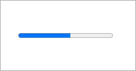
Default progress bar appearance across different browsers:

If no value attribute is specified the progress element will show up with the loading animation:
<progress></progress>
Result:
Styling the progress
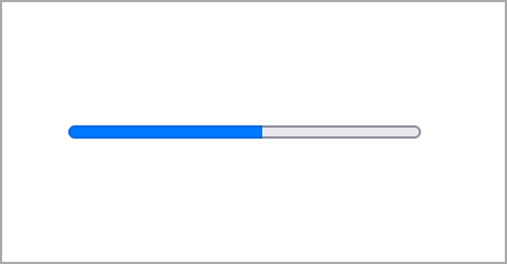
Accent color
You can set the color of the current progress by defining the accent-color property.
progress {
  accent-color: coral;
}
Result:
The accent-color property is a new thing and can be used to style form elements as well. However, at the time this article is written, it is lacking full browser support. So you shouldn’t rely on it much right now, but worth knowing about this property, to use it in the future.
Non-standard styling
Currently, there are some non-standard pseudo-elements available to style the progress tag parts. It is recommended not to use these selectors in production as the behavior is not consistent and may change in the future. But it’s worth knowing that these kinds of properties exist.
For these properties to work, first thing you’ll need to set the appearance of the progress element to none.
progress {
  -webkit-appearance: none;
}
The first one is the ::-webkit-progress-bar pseudo-element. It represents the entire progress element. You can use it to set the background color. Will only work in browsers based on Blink or WebKit.
::-webkit-progress-bar {
  background-color: aliceblue;
}
To style the actual value use the ::-webkit-progress-value selector for Blink or WebKit based browsers and ::-moz-progress-bar for Firefox browser.
::-webkit-progress-value {
  background-color: coral;
}

::-moz-progress-bar {
  background-color: coral;
}
Result:
Pseudo-elements
The progress element can also be styled with pseudo-elements, ::before representing the background and ::after representing the progress bar. However, pseudo-elements for the progress element are not supported by all browsers (Safari and Firefox don’t have support).
progress {
  position: relative;
}

progress::before,
progress::after {
  content: "";
  position: absolute;
  top: 0;
  left: 0;
  height: 100%;
}

progress::before {
  width: 100%;
  background: burlywood;
}

progress::after {
  width: 75%;
  background: brown;
}
Result:
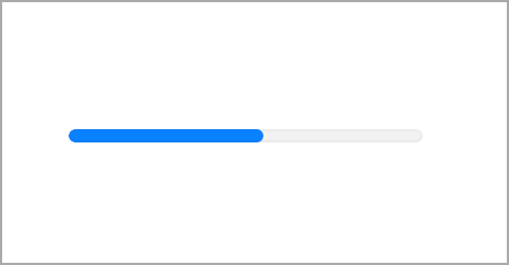
Cross-browser friendly solution
To make the progress bar look and behave the same way in all browsers you’ll need to wrap it in a div. The div will replace the appearance of the progress bar.
<div class="progress-container">
  <progress value="75" max="100">75%</progress>
</div>
First, you need to hide the progress element by setting its opacity to 0.
progress {
  opacity: 0;
}
Then, add the desired styles to the div. If you want it to take up the same width as the progress element, set the display property to inline-block. Otherwise, the div will span 100% of the container, and its width should be controlled via width property.
.progress-container {
  position: relative;
  display: inline-block;
  background: #eee;
  height: 20px;
  border-radius: 6px;
  overflow: hidden;
}
To display the progress value we’ll use the ::before pseudo-element.
.progress-container::before {
  content: "";
  position: absolute;
  top: 0;
  left: 0;
  height: 100%;
  width: 75%;
  background: turquoise;
}
Result:
For the progress bar to be more descriptive let’s add a label and a numeric value. The p tag will represent the label, and its pseudo-element will display a numeric value.
<div class="progress-element">
  <p class="progress-label">HTML</p>
  <div class="progress-container">
    <progress max="100" value="75">75%</progress>
  </div>
</div>
.progress-label {
  position: relative;
}

.progress-label::after {
  content: "75%";
  position: absolute;
  top:0;
  right: 0;
}
Result:
HTML
Animating a progress bar with CSS
If you want to animate progress value on page load, you can add a CSS animation to the pseudo-element.
First, let’s create a keyframe for progress value animation. Since we will animate the width of the pseudo-element, the value will represent the progress percentage:
@keyframes progress-animation {
  to {
    width: 75%;
  }
}
Then we need to set the pseudo-element width to 0 and then specify the animation property.
.progress-container::before {
  content: "";
  position: absolute;
  top: 0;
  left: 0;
  height: 100%;
  background: turquoise;
  width: 0;
  animation: progress-animation .7s ease-in forwards;
}
Finally to complete the animation we need to animate the percentage value stored in the pseudo-element. There’s a way to animate the numeric value using the CSS counter.
NOTE: Animating numeric values using CSS is not supported by all browsers! So as a workaround you can set pseudo-elements’ content value to a progress value (e.g. “75%”) without animation.
@property --num {
  syntax: '<integer>';
  initial-value: 0;
  inherits: false;
}

.progress-label::after {
  counter-reset: num var(--num);
  content: counter(num) '%';
  position: absolute;
  top:0;
  right: 0;
  animation: progress-text 1s ease-in forwards;
}

@keyframes progress-text {
  to {
    --num: 75;
  }
}
Demo
The end result can be viewed on CodePen:
See the Pen Styled progress bar by Tippingpoint Dev (@tippingpointdev) on CodePen.