The difference between min-width vs max-width in CSS media queries
When learning about CSS media queries, sometimes it can be confusing what’s the difference between min-width and max-width properties.
Page contents:
The difference
In short, the main difference between the two is the condition when the styles will be applied:
@media (min-width: 800px) { … }- for browser’s viewport width equal or wider than 800px;@media (max-width: 800px) { … }- for browser’s viewport width equal or narrower than 800px.
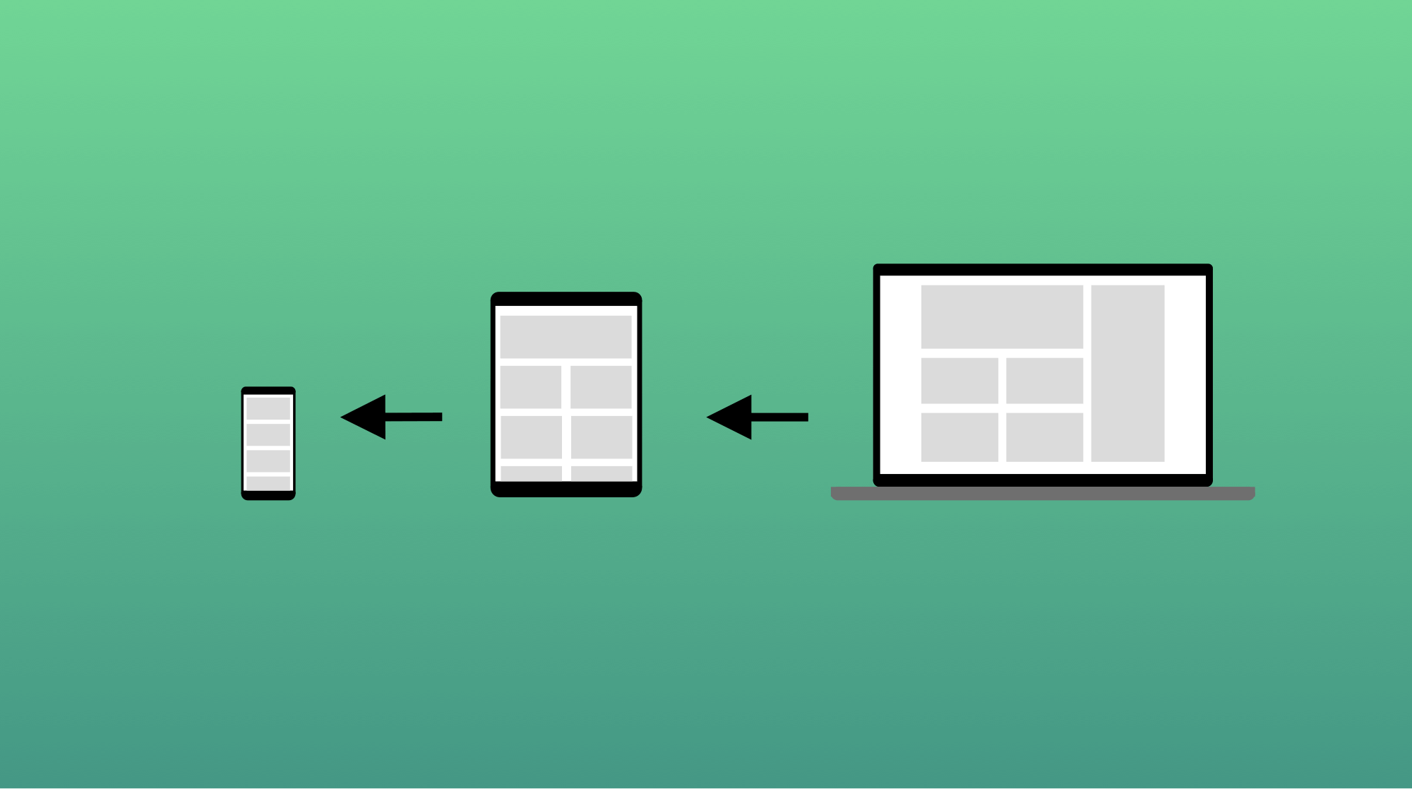
If you’re starting a new project and have to choose between min-width and max-width media queries, that means you’re choosing between two approaches:
- Mobile-first;
- Desktop-first.
Mobile-first approach
The mobile-first approach means that you design/develop styling for your app starting from a mobile device going all the way up to a desktop computer and even TVs. For every following device, the breakpoint is specified with the media query min-width rule.
The mobile-first approach is considered a good practice, as mobile user count takes more than 50% of the market.

In the following example, the container width will be 100% on viewports from 0 up to 768px. All viewports above 768px will have a container width of 80%, unless you specify it with another rule with a higher width value (breakpoint).
The min-width example:
.container {
  width: 100%;
  padding: 0 20px;
}

@media (min-width: 768px) {
  .container {
    width: 80%;
  }
}
Desktop-first approach
Unlike the mobile-first approach, the desktop-first means that you apply styles to the large viewports first (like the desktop computers), and then specify rules to target smaller viewports.
In the following example, the container width will be 80% on all viewports down to 768px. All viewports below 768px will have a container width of 100% and a side paddings of 20px.
With the desktop-first approach, we’re essentially achieving the same result as with mobile-first.
The max-width example:
.container {
  width: 80%;
}

@media (max-width: 768px) {
  .container {
    width: 100%;
    padding: 0 20px;
  }
}
Breakpoints
Breakpoints are fixed values of various viewport widths. By specifying your media queries rules layout going to “break” at given points.
The most popular breakpoint values as per Bootstrap are:
| Name | Width |
|---|---|
| Mobile portrait | <576px |
| Mobile ladscape | ≥576px |
| Tablet portrait | ≥768px |
| Tablet ladscape | ≥992px |
| Laptop | ≥1200px |
| Desktop and above | ≥1400px |
The Bootstrap framework has a very popular and common set of breakpoints matching most of the various devices. However it’s not always the case, you can specify your own widths, based on your project. The freeCodeCamp has a nice article on handling breakpoints.