The difference between Rem vs Em in CSS explained
It can be confusing and frustrating when trying to understand units in CSS. Especially relative units like em and rem.
In this guide, I’ll explain what they are and how are they different. As well as provide additional information like, examples, use cases and pitfalls so you better understand the topic.
Contents:
Rem vs em difference in essence:
emunits are relative to the current elementfont-sizevalue;remunits are relative to the root element (html)font-sizevalue.
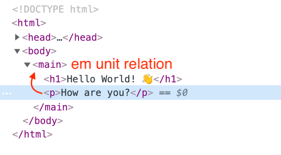
EM units
The em unit is relative to the font-size of the current element or the next parent element in case no font-size property is set to the current element.
The formula to calculate the value of em unit is em unit × element font size = value. So if the font-size is set to 14px then 1em will be equivalent to the 14px (1 × 14 = 14).
The name em was originally a reference to the width of the capital M in the typeface and size being used.
em units can be used on a variety of CSS properties like padding, margin, etc, not only font-size.
Example 1:
p {
  font-size: 14px;
  margin-bottom: 1em; /* computed value of margin-bottom will be 14px */
}
Example 2:
p {
  font-size: 14px;
}

p span {
  font-size: 1.2em; /* computed value will be 16.8px (1.2 × 14 = 16.8) */
}
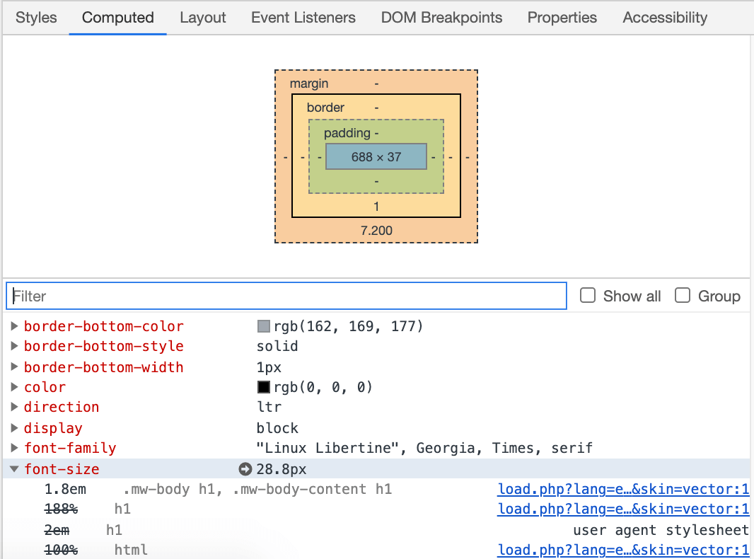
To check the resulted size in pixels you can use the Computed tab under Element Inspector in DevTools (same in all browsers DevTools).
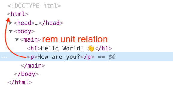
REM units
rem stands for Root EM. The root is being the html element. So the rem unit is relative to the font-size of the html element.
It uses the same formula to calculate the value rem unit × html element font size = value.
Example:
html {
  font-size: 14px;
}

p {
  font-size: 1.1rem; /* computed value will be 15.4px (1.1 × 14 = 15.4) */
}
Examples
Following pen serves as a visual aid to show the difference between rem and em units. Change the font-size of html and .container elements to see how it affects headings and paragraphs:
See the Pen CSS rem vs em visualized example by Nikita Hlopov (@nikitahl) on CodePen.
Use cases
Unlike pixels em and rem are relative units. Thus is easier to control and scale different CSS properties of an element since relative units can be applied not only for font-size. That’s why they come in handy for styling responsive/adaptive interfaces.
One of the simplest examples is setting the font-size on the html element and use rem units to set the font-size for typography elements (h1, h2, p…). As an addition em units can be used to set the margin for the same elements.
With this approach, you’ll need to change only one property at a given breakpoint. Consider the code below:
html {
  font-size: 16px;
  line-height: 1.5;
}

body {
  margin: 10px;
}

h1 {
  font-size: 3.2rem;
  margin: .3em 0;
}

h2 {
  font-size: 2.2rem;
  margin: .5em 0;
}

h3 {
  font-size: 1.4rem;
  margin: .4em 0;
}

p {
  font-size: 1.2rem;
}

@media screen and (max-width: 768px) {
  html {
    font-size: 14px;
  }
}
Result:
See the Pen Font scaling with rem units by Nikita Hlopov (@nikitahl) on CodePen.
Pitfalls
While em and rem units are great, there are some pitfalls that aren’t necesserily bad but you have to be aware of.
Nested inheritance
Setting em units for the same child elements that can be nested multiple levels down the tree may cause a negative effect. Since em units calculate value based on parent element font-size (in case current element font-size is missing) nested element’s font-size value will increase with each nesting level.
HTML:
<div class="container">
  Container text
  <div class="nested">
    Nested element text
    <div class="nested">
      Nested element text
      <div class="nested">
        Nested element text
      </div>
    </div>
  </div>
</div>
CSS:
.container {
  font-size: 16px;
}

.nested {
  font-size: 1.5em;
}
Result:
Browser font size settings
A user can define font size inside the browser settings. This means that elements that don’t have an explicit font-size property set will scale to the user-selected font size. Elements that have an absolute font-size value set like px will remain the same size. Elements with relative units like em or rem will scale accordingly.
Complexity
The use of relative units can bring complexity to a codebase and maintenance especially if all font sizes use em units. It will be harder to trace and debug an issue since all values will be dependant. Issues like nested inheritance mentioned above may arise.
Accessibility
In terms of accessibility relative units em and rem are more preferable. Relative units can scale which makes UX more pleasant and UI more readable thus more accessible. I highly recommend this definitive guide on Pixels vs. Relative Units in CSS: why it’s still a big deal to better understand the implication of relative units and how it affects different groups of users.
Tools
It’s easy to calculate the value of em and rem units to pixels if you know the formula (relative unit × element font size = value). Also, you can always check the browsers’ Element Inspector for the computed values.
But if you feel lazy or want to quickly fiddle around with values here are some nice online tools to convert values.
- http://pxtoem.com/
- https://nekocalc.com/px-to-rem-converter
- https://www.w3schools.com/TAGS/ref_pxtoemconversion.asp
Final thoughts
I’ve tried to cover all the basics in this article to make it clear for you about the difference between em vs rem.
Relative units are great and can make your UI more appealing and accessible. Just remember to use caution when working with em and rem units.
In the end my tips for you are:
- don’t go to extremes;
- use relative units sparingly;
- test well before publishing;
- consult with other people if possible.