Native HTML autocomplete with dropdown for input field from list
Did you know that you can create a native HTML autocomplete field with dropdown? Yes, it is possible with just a few lines of code.
Markup
It works as follows. We’ll need to use an input element with a list attribute that will act as an autocomplete field.
Next we need to assign it a list attribute that should have the value of an id attribute of the datalist element.
The datalist element contains a set of predefined option elements that act as suggestions for our autocomplete input element.
The complete HTML code will look as follows:
<label for="language-field">Choose a programming language:</label>
<input list="languages" id="language-field" name="language-field" />

<datalist id="languages">
  <option value="C">
  <option value="C#">
  <option value="C++">
  <option value="JavaScript">
  <option value="JAVA">
  <option value="PHP">
  <option value="Perl">
  <option value="Python">
  <option value="Ruby">
  <option value="Rust">
</datalist>
Result:
Click on the label or input and start typing.
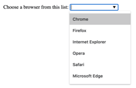
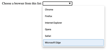
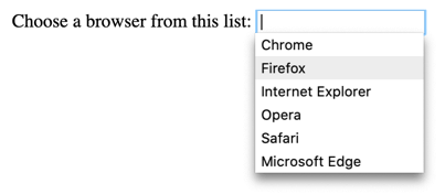
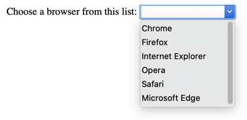
Appearance and behavior
The appearance of the autocomplete input field and the suggestion box will differ depending on the browser and the operating system. So that’s an important thing to keep in mind when designing an interface.
CSS
The input field is a common form element and it is easy to style consistently across different browsers, similar to the select element.
By default, the datalist element has a style of display: none. So when a user clicks on the input field the dropdown shown is not the datalist element, but instead a list preview rendered by the browser.
That means to make the dropdown look consistent across different browsers additional functionality has to be added, like custom JavaScript and CSS.
To change the appearance of the arrow, you’ll need to hide it and then you can use encoded SVG as a background image.
input#language-field::-webkit-calendar-picker-indicator {
  display: none;
}

input#language-field {
  background-image: url("data:image/svg+xml,%3Csvg xmlns='http://www.w3.org/2000/svg' width='292.4' height='292.4'%3E%3Cpath fill='%23333' d='M287 69.4a17.6 17.6 0 0 0-13-5.4H18.4c-5 0-9.3 1.8-12.9 5.4A17.6 17.6 0 0 0 0 82.2c0 5 1.8 9.3 5.4 12.9l128 127.9c3.6 3.6 7.8 5.4 12.8 5.4s9.2-1.8 12.8-5.4L287 95c3.5-3.5 5.4-7.8 5.4-12.8 0-5-1.9-9.2-5.5-12.8z'/%3E%3C/svg%3E");
  background-repeat: no-repeat;
  background-position: right 8px center;
  background-size: 9px;
}
JavaScript
The datalist element has no particular Web API attached to it, so you’ll just have to use default JavaScript methods to manipulate your autocomplete field and dropdown list.
This means that in order to customize the appearance and behavior of it, you’ll have to sacrifice native behavior.
Browser Compatibility
The datalist is a semantic HTML element and is supported in all modern browsers. However some issues may occur if you’re willing to support older browsers, please refer to the datalist compatibility table.

Final thoughts
All in all in my opinion, while the default styling and functionality are left untouched the HTML autocomplete is a pretty unique paradigm in web development. However, it lacks some flexibility and customization which can make it a rare use case.