Select tag custom styles with CSS only
The select tag is one of the most confusing and hard to style form elements in HTML. Luckily there is a simple and cross-browser consistent solution to give custom styles for select tag using only CSS.
The problem with styling select tag
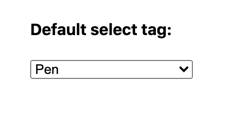
select is one of those HTML tags that have different appearances across browsers.
That’s the main reason why developers applying custom styles for select tag. A study has shown that the select tag is the number one form control developers are creating a custom style for. The same study shows that the reasons for custom styling select tag in the first place are:
- Browser inconsistencies;
- Couldn’t change the appearance sufficiently.
The CSS solution
To apply custom style for a select tag, you’ll need the CSS only approach, no additional HTML, or JavaScript.
That means that native behavior and accessibility are preserved and less code is used which is good.
Let’s take the basic select tag markup.
HTML:
<select>
  <option value="pen">Pen</option>
  <option value="pineapple">Pineapple</option>
  <option value="apple">Apple</option>
  <option value="pen">Pen</option>
  <option value="pen">PenPineappleApplePen</option>
</select>
As for the CSS, we’ll reset basic styles first.
CSS:
select {
  box-sizing: border-box;

  -moz-appearance: none;
  -webkit-appearance: none;
  appearance: none;

  background-color: transparent;
  border: none;
  padding: 0;
  margin: 0;
  width: 100%;

  font-family: -apple-system, BlinkMacSystemFont, 'Segoe UI', Roboto, Oxygen, Ubuntu, Cantarell, 'Open Sans', 'Helvetica Neue', sans-serif;
  font-size: 16px;
  font-weight: 500;
  line-height: 1.3;

  cursor: default;
}
💡 NOTE: The appearance rule will remove the dropdown arrow. However, it is not supported by the IE browser.
If you need to reset default styling for the IE browser, add the following rule:
select::-ms-expand {
  display: none;
}
Source: StackOverflow.com
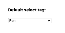
Now that we’ve removed the default dropdown arrow, we can add a custom one. It can be achieved via an encoded background SVG image.
This solution is cross-browser-friendly. And since it’s SVG you can further customize it if needed.
select {
  padding: 5px 10px 5px 8px;
  border: 1px solid #999;
  border-radius: 5px;
  background-image: url("data:image/svg+xml,%3Csvg xmlns='http://www.w3.org/2000/svg' width='292.4' height='292.4'%3E%3Cpath fill='%23333' d='M287 69.4a17.6 17.6 0 0 0-13-5.4H18.4c-5 0-9.3 1.8-12.9 5.4A17.6 17.6 0 0 0 0 82.2c0 5 1.8 9.3 5.4 12.9l128 127.9c3.6 3.6 7.8 5.4 12.8 5.4s9.2-1.8 12.8-5.4L287 95c3.5-3.5 5.4-7.8 5.4-12.8 0-5-1.9-9.2-5.5-12.8z'/%3E%3C/svg%3E");
  background-repeat: no-repeat;
  background-position: right 8px center;
  background-size: 9px;
  color: #333;
}
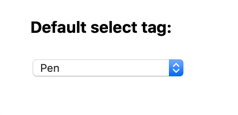
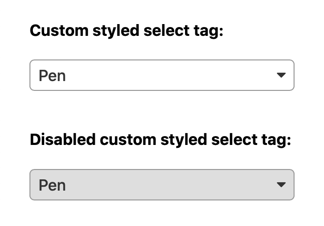
Next, let’s add styles for pseudo-classes :hover and :focus. For the :focus state we’ll add the box-shadow property and remove the default outline, now that we have rounded corners.
select:hover {
  border-color: #777;
}

select:focus {
  border-color: #999;
  box-shadow: 0 0 1px 2px #6db4ff;
  outline: none;
}
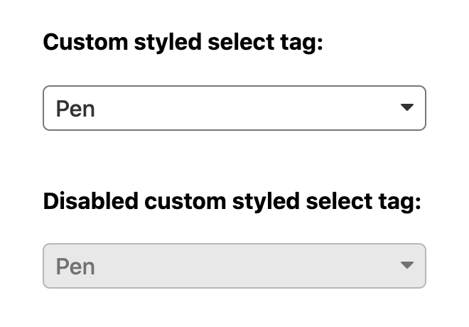
To finalize let’s add custom styles for the select disabled state.
select:disabled,
select[aria-disabled=true] {
  cursor: not-allowed;
  background-color: rgba(211, 211, 211, .75);
}

select:disabled:hover,
select[aria-disabled=true]:hover {
  border-color: #999;
}
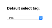
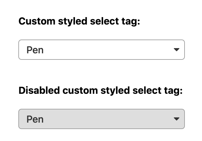
Final result
With custom styles applied for the select tag it will look consistent and more appealing across different browsers:

If you wish to handle long text overflowing your select tag, check out my article where I explain how to handle such case.
The final result with all the code is available on CodePen:
See the Pen Custom styled select tag by Nikita Hlopov (@nikitahl) on CodePen.
The future of select tag styling
Currently, there’s an online initiative called Open UI to standardize UI components on the web such as the select tag.
The purpose of Open UI to the web platform is to allow web developers to style and extend built-in web UI controls, such as select dropdowns, checkboxes, radio buttons, and date/color pickers.
This means that this organization is working toward a unifying standard of styling select and other form tags and components for that matter (so no hacks and pain). Stephanie Stimac talks about Standardizing select: What the future holds for HTML Controls in more detail at the FrontCon 2020 conference.
But as of the time this article is published the Open UI is in the infancy stage, as they call it. Hopefully in the near-future web developers will have the ability to give custom styles to all form elements with ease.