Create beautiful carousels with scroll snap CSS property
You can create beautiful carousels with a fancy and smooth snap effect by implementing a CSS-only solution.
The scroll snap effect means that each time a user finishes scrolling an element will be snapped to the edge of the scroll container.
This effect looks especially good on mobile devices, both for vertical and horizontal scrolling.
CSS snap properties
To add a basic scroll snap for a container with the scroll you’ll need to define one single property.
.scroll-container {
  scroll-snap-type: x mandatory;
}
The
scroll-snap-typeCSS property sets how strictly snap points are enforced on the scroll container in case there is one.
There are a few options available for the scroll-snap-type property.
To specify the axis use x - horizontal or y - vertical value, and for behavior use mandatory - will always snap to the next element after the scroll action, proximity - will snap to the next element when the scroll ends in the near proximity of a snap point.
For the child elements, you should specify the scroll-snap-align which will set the snap position of the element. The values can be start, end, or center.
.scroll-child {
  scroll-snap-align: start;
}
You can apply additional properties to customize the scroll behavior.
For the scroll container, you can add a scroll-padding. This property will create an offset by the edge of the scroll container. It comes in handy when there is an overlying element, like a sticky header.
.scroll-container {
  scroll-snap-type: y mandatory;
  scroll-padding: 30px;
}
For child elements, you can add a scroll-margin. This property represents the outset from the corresponding edge of the scroll container.
.scroll-child {
  scroll-snap-align: start;
  scroll-margin: 10px;
}
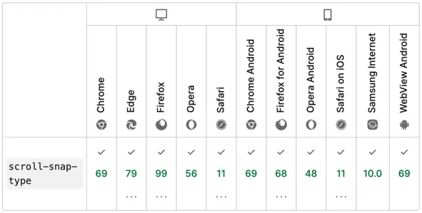
The scroll snap properties are fully supported by all modern browsers:
Creating a carousel
For this example, we’ll create a small horizontal carousel that will showcase a list of cards with programming courses.
The HTML structure of a carousel is pretty simple. A div container with child elements.
<div class="carousel">
  <div class="carousel-item"></div>
  <div class="carousel-item"></div>
  <div class="carousel-item"></div>
</div>
💡 NOTE: for accessibility concerns, you can use role="list" on a div and role="listitem" for child elements. However, it is recommended to use semantic elements like ul or ol lists.
The carousel will have a fixed width, explicit overflow property with scroll value, some paddings, and a flex display, to order items horizontally. To make space between the items the gap property of 10px is applied.
The item will have a flex property set to define the width and a few others to make it look fancy. To compensate for the gap, and align the item lets set a scroll-margin with a 5px.
.carousel {
  /* appearance */
  display: flex;
  gap: 10px;
  width: 580px;
  max-width: 90%;
  margin: 50px auto;
  padding: 10px;
  overflow-x: scroll;
  /* snap */
  scroll-snap-type: x mandatory;
}

.carousel-item {
  /* appearance */
  flex: 1 0 250px;
  padding: 20px;
  border-radius: 10px;
  box-shadow: 0 4px 6px 1px #ccc;
  color: #444;
  /* snap */
  scroll-snap-align: start;
  scroll-margin: 5px;
}
Demo
The end result with complete code can be viewed on CodePen:
See the Pen Carousel by Nikita Hlopov (@nikitahl) on CodePen.