Simple carousel-like slider with pure CSS
In this article, I’ll show you how to build a simple yet elegant CSS-only carousel slider for smooth, automatic scrolling.
Unlike other carousels that allow users to manually scroll, this one will autoplay infinitely, pausing on hover.
It won’t have any controls; it will just scroll smoothly from side to side, highlighting specific items.

Markup
I will wrap the carousel element inside a wrapper that spans the full width of the page. This wrapper is essential for properly positioning the carousel and ensuring it takes up the entire page width.
Let’s use a section element with a class name of carousel-section, as it may also contain other content, such as text and images.
<section class="carousel-section">
  <div class="css-carousel">
    ...
  </div>
</section>
For the sake of this example, I’ll use plain images as carousel slides, but any other content can be used as well.
<section class="carousel-section">
  <div class="css-carousel">
    <figure>
      <img src="img-1.png" alt="First slide">
    </figure>
    <figure>
      <img src="img-2.png" alt="Second slide">
    </figure>
    <figure>
      <img src="img-3.png" alt="Third slide">
    </figure>
    <!-- Add more images below ... -->
  </div>
</section>
Once you’ve added the necessary markup, make sure to include enough slide elements so that the carousel has sufficient content to scroll through.
Styles
To make this carousel function properly, the first step is to add overflow: hidden to the wrapper element.
.carousel-section {
  overflow: hidden;
}
For the carousel element, the slides need to align horizontally and occupy the full width. We’ll use display: flex along with a few other rules to improve its appearance.
.css-carousel {
  display: flex;
  align-items: stretch;
  gap: 3px;
}
We’ll need to specify both the width and height for the image elements.
.css-carousel img {
  display: inline-block;
  margin: 0;
  padding: 0;
  width: 400px;
  height: 100%;
}
The objective of this carousel is to scroll infinitely. We can make it move from one end to the other, looping back continuously.
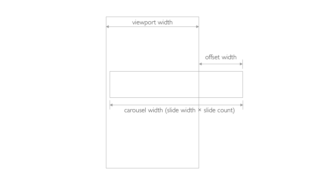
The trickiest part is specifying the correct value at which the carousel will scroll. This value represents the portion of the carousel that extends outside the viewport.
To calculate this offset value, we’ll use a mathematical formula. The final value must be negative, as the carousel will start moving to the left along the X-axis.
O - offset
SW - slide width
SC - slice count
VW - viewport width (in percent)

O = -(SW × SC) - VW

We’ll use CSS custom properties (variables) and the calc() function to compute the offset value.
💡 NOTE: To make the offset value negative, we’ll subtract it from 0.
:root {
  --slide-count: 6; /* number of slides in the carousel */
  --slide-width: 400px; /* width of a single slide */
  --carousel-edge-pos:
      calc( 0% - ((var(--slide-width) * var(--slide-count)) - 100%) ); /* formula to calulate the offset value */
}
Lastly, we’ll add an animation to the carousel element and enable it to pause on hover.
The animation will manipulate the translateX property, causing the carousel to move horizontally.
.css-carousel {
  /* ... */
  -webkit-overflow-scrolling: touch;
  animation: scroll 40s linear alternate infinite;
  animation-play-state: running;
}

.css-carousel:hover {
  animation-play-state: paused;
}

@keyframes scroll {
  from {
    transform: translateX(0);
  }
  to {
    transform: translateX(var(--carousel-edge-pos));
  }
}
Complete CSS code:
:root {
  --slide-count: 6; /* number of slides in the carousel */
  --slide-width: 400px; /* width of a single slide */
  --carousel-edge-pos:
      calc( 0% - ((var(--slide-width) * var(--slide-count)) - 100%) ); /* formula to calulate the offset value */
}

.carousel-section {
  overflow: hidden;
}

.css-carousel {
  display: flex;
  align-items: stretch;
  gap: 3px;

  -webkit-overflow-scrolling: touch;
  animation: scroll 40s linear alternate infinite;
  animation-play-state: running;
}

.css-carousel:hover {
  animation-play-state: paused;
}

.css-carousel img {
  display: inline-block;
  margin: 0;
  padding: 0;
  width: var(--slide-width);
  height: 100%;
}

@keyframes scroll {
  from {
    transform: translateX(0);
  }
  to {
    transform: translateX(var(--carousel-edge-pos));
  }
}
Demo
You can find a full demo with a complete code example on my CodePen. The demo also includes additional styling to enhance the appearance and functionality of the carousel:
See the Pen Untitled by Nikita Hlopov (@nikitahl) on CodePen.
