Text gradient with pure CSS
Text with a gradient background effect is a nice way to display headings on your website, and it can be done with pure CSS.
The text can be contained in any HTML tag, whether it’s a heading h1 to h6, paragraph p, or even a div.
For the sake of example let’s use the h2 tag.
<h2>Hello World!</h2>
To apply a gradient for a text we’ll need to use a background-image property with a gradient and a background-clip property with text value to specify where the background extension limit is. Also to make the gradient visible, we need to set the transparent color.
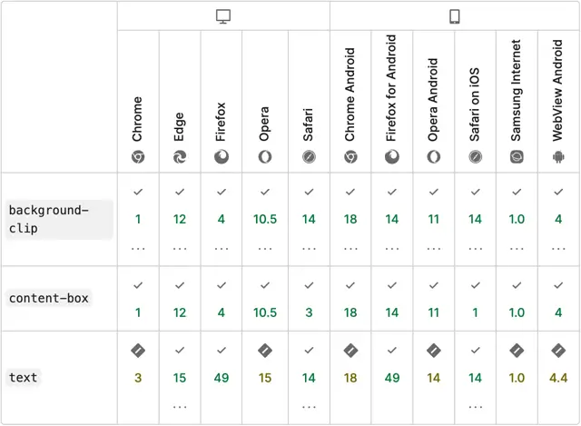
💡 NOTE: For Chrome-based browsers the text value is only supported by -webkit-background-clip (and not by background-clip).
h2 {
  background-image: linear-gradient(45deg,#ff7200,#5c00ff);
  background-clip: text;
  -webkit-background-clip: text;
  color: transparent;
}
Result:
Hello World!
That’s it. The background-clip property is supported in all modern browsers:
Hover state
To go a bit further, you can add a hover effect by changing the gradient via the background-image property. You can reverse the gradient colors.
h2:hover {
  background-image: linear-gradient(45deg,#5c00ff, #ff7200);
}
Result:
Hello World!
💡 NOTE: However in CSS you cannot transition gradients. If you want to add a smooth gradient transition on hover, you'll have to implement a solution with pseudo-classes as described by Keith J. Grant.
To apply a smooth transition, set your text tag to position: relative.
For the pseudo-element, make it absolutely position, and have the same gradient properties, but most important it’s content property should be equal to the actual text.
Finally, on hover, you change the opacity.
h2 {
  position: relative;

  background-image: linear-gradient(45deg,#ff7200,#5c00ff);
  background-clip: text;
  -webkit-background-clip: text;
  color: transparent;
}

h2::before {
  content: 'Hello World!';

  position: absolute;
  top: 0;
  right: 0;
  bottom: 0;
  left: 0;

  background-clip: text;
  -webkit-background-clip: text;
  color: transparent;
  background-image: linear-gradient(45deg,#5c00ff,#ff7200);

  transition: opacity 0.5s ease-in-out;
  opacity: 0;
}

h2:hover::before {
  opacity: 1;
}
Result:
Hello World!
Demo
You can find a full demo with a complete code example on my CodePen:
See the Pen Untitled by Nikita Hlopov (@nikitahl) on CodePen.