A complete guide on how to implement a dark mode
A dark mode is almost a must-have feature for modern-day web apps. In this guide, I’ll show you how to implement a dark mode for your project.
Contents:
Dark mode can offer numerous benfits, such as reducing eye strain and extending battery life as well as providing a sleek and modern aesthetic that enhances the overall user experience.
However, not all users like the dark mode, so it’s also important to provide them with the option to switch between dark and light modes.
Handle color theme with CSS only
To begin, you can handle the basic color theme with CSS. For that, there is a prefers-color-scheme media query. It detects if a user agent has requested a color theme.
The code below will open a page with a white background and dark text on a light theme, and a dark background with light text on a dark theme.
body {
  background: #fff;
  color: #292929;
}

@media (prefers-color-scheme: dark) {
  body {
    background: #434343;
    color: #efefef;
  }
}
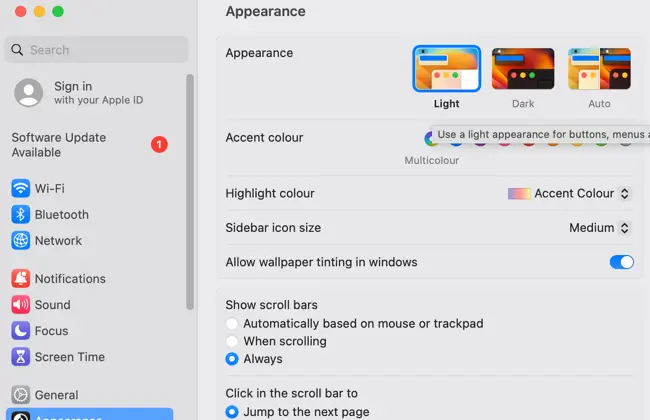
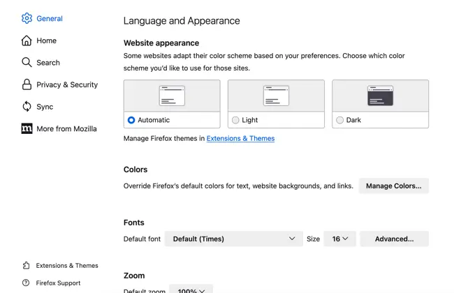
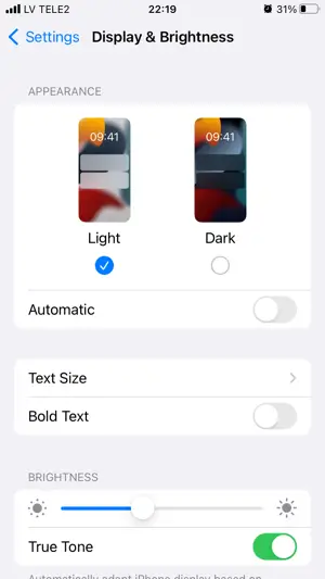
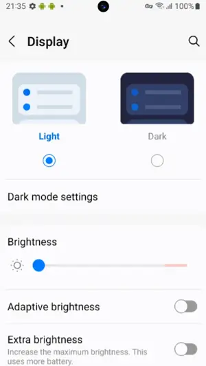
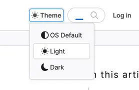
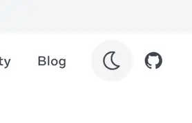
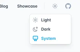
Users can set the color theme on their devices and browsers. Below are some examples of how a user can change a color scheme on their device or browser.
Handle color theme with JavaScript
While CSS solution solves the color theme issue for some users, you can improve User Experience by providing an additional theme toggle control.
Toggle control
Toggle control allows users to instantly change the color theme directly on the site, without changing device or browser settings.
It also allows them to check out how your website looks on different themes and pick the one that suits them.
To create such functionality we will need a toggle control for users to click on and some JavaScript code.
I’ve already explained how you can create a toggle switch in my other article, so now we can focus on implementing the theme toggle functionality.
To simplify, it should be a singular element, typically a button, to which we will assign an event.
Toggling theme
In JavaScript, we need to add an event listener to the theme toggle element, which will toggle the theme-dark class name on the body element.
const themeToggleControl = document.getElementById("theme-toggle");

function toggleTheme() {
  document.body.classList.toggle("theme-dark");
}

themeToggleControl.addEventListener("click", toggleTheme);
In CSS we need to specify the theme-dark class selector with proper rules, dark background, and light text color.
.theme-dark {
  background: #434343;
  color: #efefef;
}
Saving to Local Storage
To improve the theme toggle functionality you can let your website remember the user’s theme preference.
To do so, we can use the localStorage property.
We’ll need to update the existing event handler, and check if the localStorage object contains the property related to the site’s color theme.
const themeToggleControl = document.getElementById("theme-toggle");

function toggleTheme(e) {
  // check if the localStorage has a theme property and event occurred
  if (window.localStorage.theme && e) {
    // set current theme from the localStorage to a variable
    const theme = window.localStorage.theme;
    // remove class name related to a current color theme from the body
    document.body.classList.remove("theme-" + theme);
    // set the localStorage value equal to the opposite color theme based on a condition
    window.localStorage.theme = theme === "light" ? "dark" : "light";
  } else if (!window.localStorage.theme) {
    // if the localStorage has no value set it to the default value, e.g. light
    window.localStorage.theme = "light";
  }

  // set class name for the body tag based on localStorage value
  document.body.classList.add("theme-" + window.localStorage.theme);
}

themeToggleControl.addEventListener("click", toggleTheme);

// Run function to check the localStorage and set proper class name to body tag
toggleTheme();
Detecting device setting
Finally, you can improve User Experience by detecting the user’s preferred color theme and setting your site’s theme and toggle switch based on this.
With the help of the matchMedia method, you can detect the user’s preferred color scheme.
The following expression will return true if the user has set a dark theme.
window.matchMedia("(prefers-color-scheme: dark)").matches;
For the JavaScript code, we need to update our conditions to take the result of the matchMedia method into account.
const themeToggleControl = document.getElementById("theme-toggle");

function toggleTheme(e) {
  // check user's preferred color theme
  const isDark = window.matchMedia('(prefers-color-scheme: dark)').matches;
  // set initial theme variable
  let theme = isDark ? "dark" : "light";
  // check if the localStorage contains value
  if (window.localStorage.theme && !e) {
    theme = window.localStorage.theme;
  } else if (e) { // handle event
    // set the currentTheme variable based on a condition, first check the localStorage, otherwise set from theme variable
    const currentTheme = window.localStorage.theme || theme;
    // remove class name related to a current color theme from the body
    document.body.classList.remove("theme-" + currentTheme);
    // set the localStorage value equal to the opposite color theme based on a condition
    window.localStorage.theme = currentTheme === "light" ? "dark" : "light";
    // set the theme variable value, to later use to assign class name
    theme = window.localStorage.theme;
  } else if (!window.localStorage.theme && isDark) {
    theme = "dark";
  }

  // set class name for the body tag based on the theme variable value
  document.body.classList.add("theme-" + theme);
}

themeToggleControl.addEventListener("click", toggleTheme);

// Run function to check the localStorage and set proper class name to body tag
toggleTheme();
Additionally, you can listen for preferred user color theme changes.
window
  .matchMedia("(prefers-color-scheme: dark)")
  .addEventListener("change", ({ matches: isDark }) => {
    console.log("isDark: ", isDark); // isDark will return true or false
  });
Images
To complete this guide you can handle images based on user preferred color theme with the help of media attribute on a source tag inside the picture tag.
<picture>
  <source srcset="dark.png" media="(prefers-color-scheme: dark)">
  <img src="light.png">
</picture>
Demo
You can find a full demo with a complete code examples on my CodePen:
See the Pen Untitled by Nikita Hlopov (@nikitahl) on CodePen.