Toggle switch button with Pure CSS
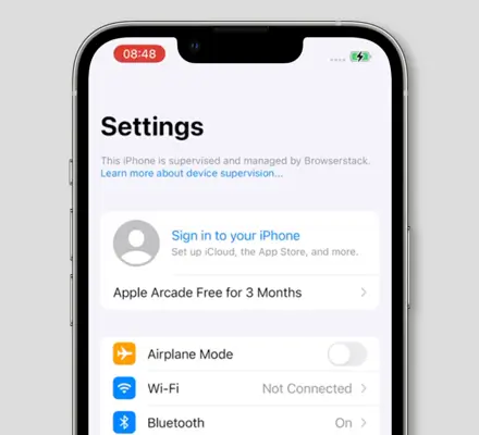
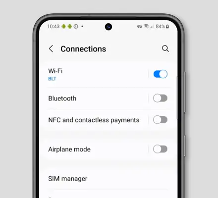
A toggle switch button is a recognizable part of the User Interface. These days it is common beyond smartphones and widely used on the web.
It’s great way to let users know whether something can be enabled or disabled. E.g. toggle switch is a great control to enable the dark mode.


In this article, I’ll show you how you can implement a toggle switch button with pure HTML and CSS. The following solution will create an iOS-like feel and will ensure the same appearance across browsers as well as easy-to-use inside forms.
Markup
You can use any HTML element, but in this case, we’re going to use the checkbox element for the toggle switch.
<input class="switch-toggle" type="checkbox">
Using a checkbox over let’s say button, div, or a span, gives you a few advantages:
- You can use it in conjunction with a
labelelement (improved accessibility) - You can use pure CSS to style it (states controlled via selectors)
- You can easily get the value of the toggle control when working with forms
However in order to properly display the toggle switch and make it more accessible, we’ll need to specify additional HTML.
Let’s wrap the checkbox inside the label tag. It will serve as a click area and the span will represent the track and thumb of a switch.
<label class="switch-toggle-container">
  <input class="switch-toggle-input" type="checkbox">
  <span class="switch-toggle"></span>
</label>
Styles
First, we’ll need to hide the checkbox by making it transparent and outside of document flow.
By hiding it that way, we still can use its native state for navigation via focus state.
.switch-toggle-input {
  opacity: 0;
  position: absolute;
  z-index: -1;
}
Next, we need to set position and display styles for the label tag, in order to position our toggle switch.
.switch-toggle-container {
  position: relative;
  display: inline-block;
}
Then to give a toggle switch its distinct appearance, we’ll need to style the span element. The span will represent the track and its ::after pseudo-element will represent the thumb.
💡 NOTE: You can use the following styles to create a toggle switch control from a button or any other HTML tag.
.switch-toggle {
  position: relative;
  display: inline-block;
  margin: 0 0 10px;
  width: 50px;
  height: 30px;
  background: #ddd;
  border-radius: 50px;
  transition: background .2s ease-in-out;
  cursor: pointer;
}

.switch-toggle::after {
  content: '';
  position: absolute;
  top: 2px;
  left: 2px;
  width: 26px;
  height: 26px;
  background: #fff;
  border-radius: 50px;
  box-shadow: 0 0 3px 1px rgba(0,0,0,0.15);
  transition: left .2s ease-in-out,
              width .2s ease-in-out,
              transform .2s ease-in-out;
}
To make the thumb move on click, we’ll use the :checked pseudo-class on the checkbox input and an adjacent sibling combinator (+) to select span.
.switch-toggle-input:checked + .switch-toggle {
  background: #30e16b;
}

.switch-toggle-input:checked + .switch-toggle::after {
  left: calc(100% - 2px);
	transform: translateX(-100%);
}
For the disabled toggle let’s set dimmed gray colors with a proper cursor.
.switch-toggle-input:disabled {
  pointer-events: none;
}

.switch-toggle-input:disabled + .switch-toggle {
  cursor: not-allowed;
  background: #eaeaea;
}

.switch-toggle-input:disabled + .switch-toggle::after {
  background: #f8f8f8;
}
For accessibility, we can add an outline, on focus state.
.switch-toggle-input:focus + .switch-toggle::before,
.switch-toggle-container:active .switch-toggle-input:not([disabled]) + .switch-toggle::before {
  outline: 2px solid #5195fe;
  outline-offset: 2px;
}
Finally, for iOS-like feel, we can add a little transition for the thumb when it’s moving. On click, the thumb will grow as it moves to the opposite side and then get back to its original size.
.switch-toggle-container:active .switch-toggle-input:not([disabled]) + .switch-toggle::after {
  width: 34px;
}
Result:
Text
You can also add text to your toggle switch control, to provide additional indication whether it is on or off.
To do so we’ll specify the content property for the pseudo-element and display it accordingly.
.switch-toggle::after  {
  content: 'Off';
  display: inline-flex;
  justify-content: center;
  align-items: center;
  font-size: 11px;
  color: #444;
}

.switch-toggle-input:checked + .switch-toggle::after {
  content: 'On';
}
Result:
Demo
You can find a full demo with a complete code examples on my CodePen:
See the Pen Untitled by Nikita Hlopov (@nikitahl) on CodePen.
