SVG circle progress bar
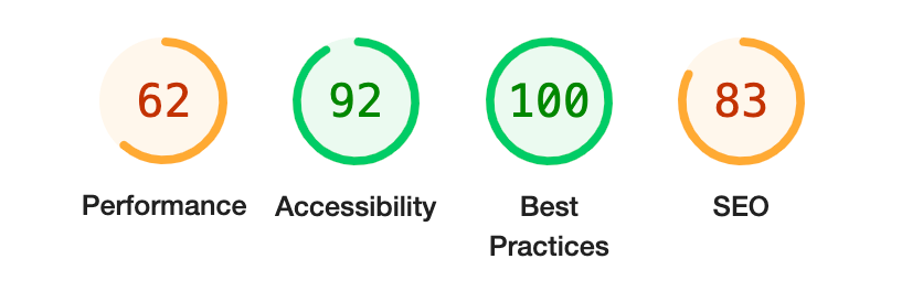
Circle progress is a popular way to highlight progress. If you want to make it look nice across all browsers you should use SVG to create a circle progress bar.
I’ve already explained how you can create a circlular progress bar using pure CSS in my article.
However, there are a few points that make SVG version different from CSS.
- with SVG you have more control over the appearance and customization.
- you can use SVG circle progress as an image, thus you can embed it into any part of the page and even display it as a background image.
- you don’t need to write additional CSS. Since SVG is an XML-based markup language, you can set all properties in one place, without touching CSS code.
Structure
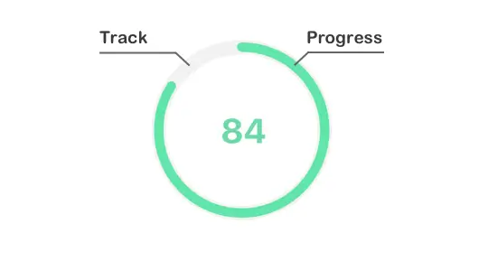
The circle progress bar will consist of two circles. One will represent the track (background), and the second will show the actual progress.
For that, we need to wrap two circle tags inside an svg tag as follows:
<svg>
  <circle></circle>
  <circle></circle>
</svg>
Styling
Next, we need to set some properties to make the circle appear as a ring shape. For svg we need to specify the size and view box, and for circle, we need to specify its radius, position and stroke width, and color.
<svg width="100" height="100" viewBox="0 0 100 100">
  <circle r="40" cx="50" cy="50" fill="transparent" stroke="#e0e0e0" stroke-width="12px"></circle>
  <circle r="40" cx="50" cy="50" fill="transparent" stroke="#e0e0e0" stroke-width="12px"></circle>
</svg>
Result:
Now both circles appear as one, this is because they are positioned on top of each other. We need to set stroke-dasharray and stroke-dashoffset properties on a second circle to show the actual progress.
stroke-dasharray- determines the pattern of the dashes and gaps in a line or borderstroke-dashoffset- specifies the distance between the start of the line or border and the beginning of the dash pattern
We need to set stroke-dasharray property value to be equal to the circumference of our circle, this way it will fill up the whole circle and be equal to 100%. Next, we need to set stroke-dashoffset to move the progress back (offset) as if we’re subtracting from our progress.
To set both properties you can use the following formulas to calculate the value.
circumference = 2 × π × radius

offset = circumference × ((100 - progress)/100)
So taking into account the dimensions of the above circle (its radius) and a progress of 75 our values will be:
stroke-dasharray: 2 × 3.14 × 70 = 439.6

stroke-dashoffset: 439.6 × ((100 - 75)/100) = 109.9
We’ll set the set stroke-dasharray and stroke-dashoffset along with the stroke value of a second circle to make it a different color.
<svg width="160" height="160" viewBox="0 0 160 160">
  <circle r="70" cx="80" cy="80" fill="transparent" stroke="#e0e0e0" stroke-width="12px"></circle>
  <circle r="70" cx="80" cy="80" fill="transparent" stroke="#60e6a8" stroke-width="12px" stroke-dasharray="439.6px" stroke-dashoffset="109.9px"></circle>
</svg>
Result:
The only problem now is that the progress is rotated and doesn’t start at the top of the circle. We can use the transform: rotate(-90deg) property to rotate it counterclockwise by 90 degrees. That way we can see that the progress is filled at 75% (3/4) of a full circle.
<svg width="160" height="160" viewBox="0 0 160 160" style="transform: rotate(-90deg)">
  <circle r="70" cx="80" cy="80" fill="transparent" stroke="#e0e0e0" stroke-width="12px"></circle>
  <circle r="70" cx="80" cy="80" fill="transparent" stroke="#60e6a8" stroke-width="12px" stroke-dasharray="439.6px" stroke-dashoffset="109.9px"></circle>
</svg>
Result:
To make the progress with rounded corners use the stroke-linecap="round" property on the progress circle.
<svg width="160" height="160" viewBox="0 0 160 160" style="transform: rotate(-90deg)">
  <circle r="70" cx="80" cy="80" fill="transparent" stroke="#e0e0e0" stroke-width="12px"></circle>
  <circle r="70" cx="80" cy="80" fill="transparent" stroke="#60e6a8" stroke-linecap="round" stroke-width="12px" stroke-dasharray="439.6px" stroke-dashoffset="109.9px"></circle>
</svg>
Result:
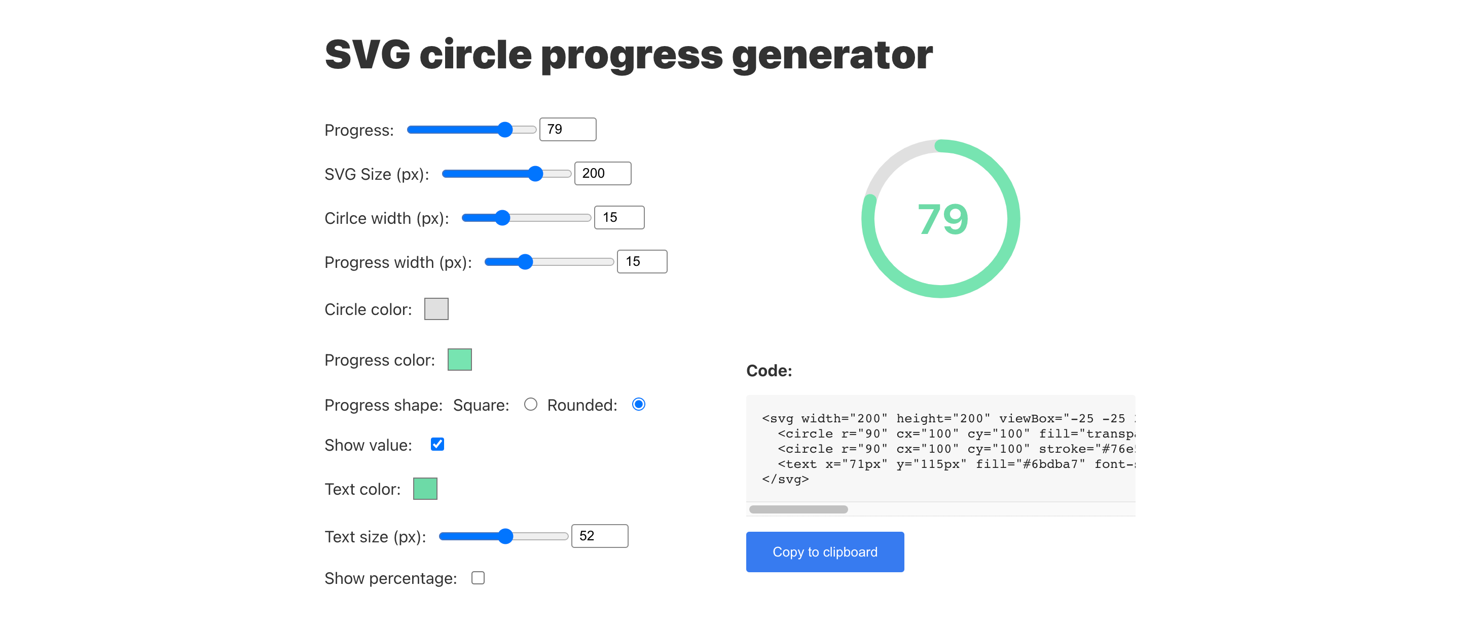
Demo
I’ve made a small tool to generate this exact circle SVG progress bar. You can modify parameters and get ready to use HTML snippet.