Circle progress bar with pure CSS and HTML
Progress bars are widely used on websites to highlight specific data in a more appealing way for users. One benefit of using a circle progress bar over a regular (horizontal) progress bar is that you can fit more progress bars in one row, thus displaying more data to the user.
I’ve already covered how you can style a progress bar in my earlier article. But now we’re going to look at how you can create a circle progress bar.
Setup
To display a circle progress bar with CSS we want to use as few HTML elements as possible. A proper way to show a progress bar is to use a semantic HTML element called progress.
<progress value="75" min="0" max="100">75%</progress>
Result:
However, it has specific default styles which make its unique appearance, thus preventing us from using all available CSS properties and displaying it as a circle.
As an alternative, we can use a div element with a progressbar role.
So to create a circle progress bar with only CSS we will need to use a div element anyway. There are two options for the markup.
Option 1
The first option is to use a regular div with a progressbar role along with additional ARIA attributes such as aria-valuenow, aria-valuemin, and aria-valuemax to indicate the range of the progress bar. HTML looks as follows:
<div class="progress-bar" role="progressbar" aria-valuenow="75" aria-valuemin="0" aria-valuemax="100"></div>
Option 2
The second option is to wrap a progress element inside a div and hide it with CSS. That way we use a native progress element that will still be accessible in the DOM (just visually hidden) and the div will act as a visual representation. HTML looks as follows:
<div class="progress-bar">
  <progress value="75" min="0" max="100" style="visibility:hidden;height:0;width:0;">75%</progress>
</div>
Conic gradient
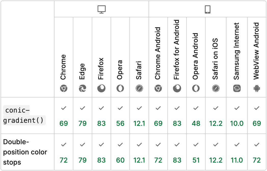
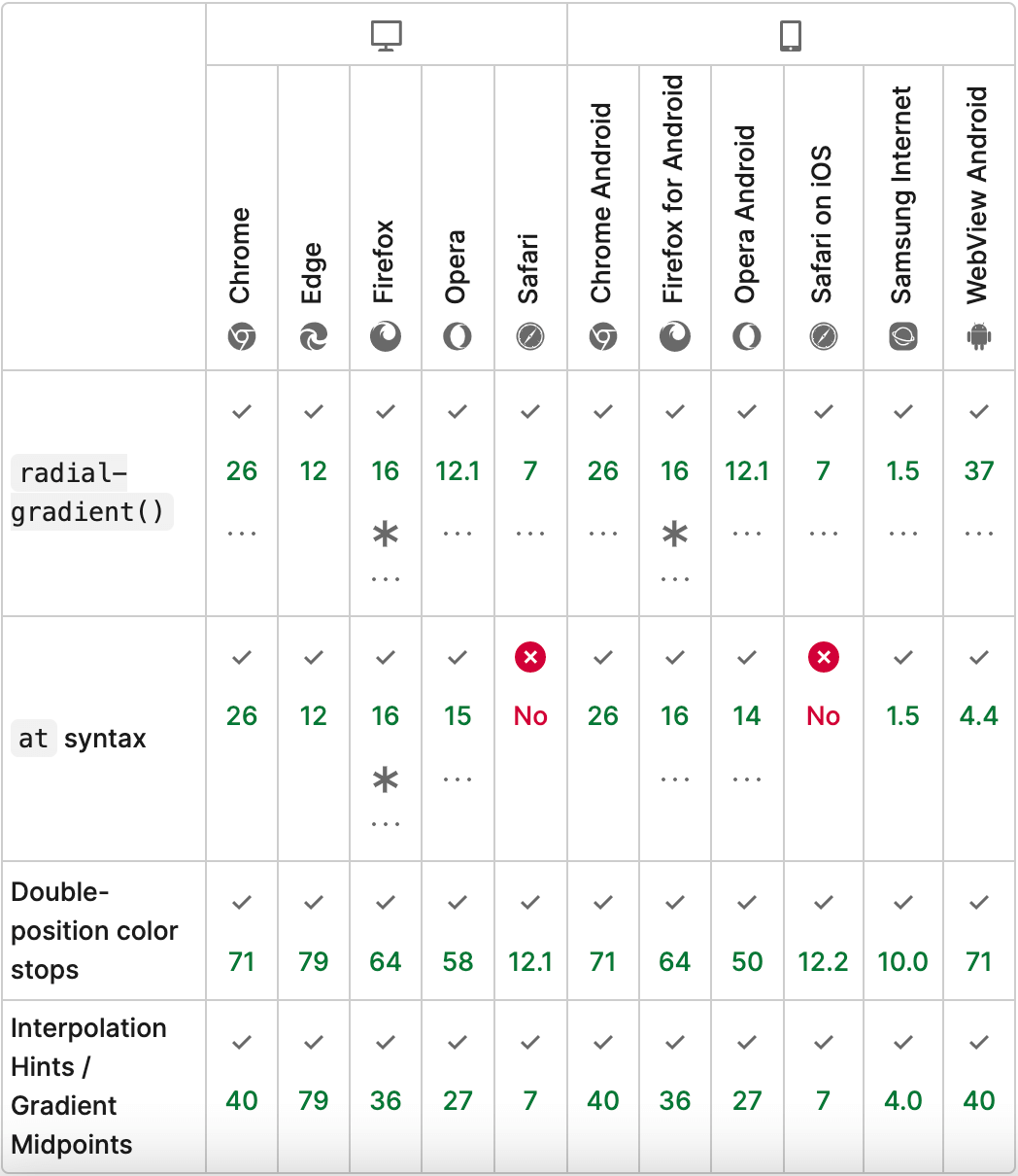
Since in both HTML approaches we will be styling a div element to create a circular progress bar, we’re going to use gradients. For the background property, we’ll set a radial-gradient function and a conic-gradient function that is available in CSS.
The conic-gradient will show the actual progress (the current value) and the radial-gradient will act as a mask on top of the conic-gradient.
.progress-bar {
  width: 100px;
  height: 100px;
  border-radius: 50%;
  background:
    radial-gradient(closest-side, white 79%, transparent 80% 100%),
    conic-gradient(hotpink 75%, pink 0);
}
Result:
To break it down. The conic-gradient function accepts multiple parameters (steps). In our case it is two steps, the first one will start at 0 degrees (12 o’clock) and span all the way up to 75% of the circumference of the circle (9 o’clock).
The radial-gradient in our case represents the mask, and consists of a white color (to match the background) and transparent color to show the progress bar.
The first parameter of the radial-gradient function is the size of the gradient’s ending shape, in our case, it is equal to the closest-side. Meaning the gradient’s ending shape meets the side of the box closest to its center.
After the size of radial-gradient, we specify the color and size of our mask (white overlay) white 79% and transparent color to take up the remaining size of the circle transparent 80% 100%. The one percent difference (79% and 80%) is made to smooth out the border of the gradient.
Browser compatibility for conic-gradient function:

Browser compatibility for radial-gradient function:

Showing the percentage
Additionally, let’s display a percentage value in the middle of the circle to inform users about the exact value of our progress bar.
To do so, we can use a pseudo-element with a content property. As for the progress bar div, we’ll need to set additional properties to center the percentage, flex in this case.
.progress-bar {
  display: flex;
  justify-content: center;
  align-items: center;

  width: 100px;
  height: 100px;
  border-radius: 50%;
  background:
    radial-gradient(closest-side, white 79%, transparent 80% 100%),
    conic-gradient(hotpink 75%, pink 0);
}

.progress-bar::before {
  content: "75%";
}
Result:
Animation
💡 NOTE: The animation of such a progress bar will only work in Chromium-based browsers.
To make the progress bar animate, we’ll need to specify the value inside a CSS variable, and then change its value inside the animation.
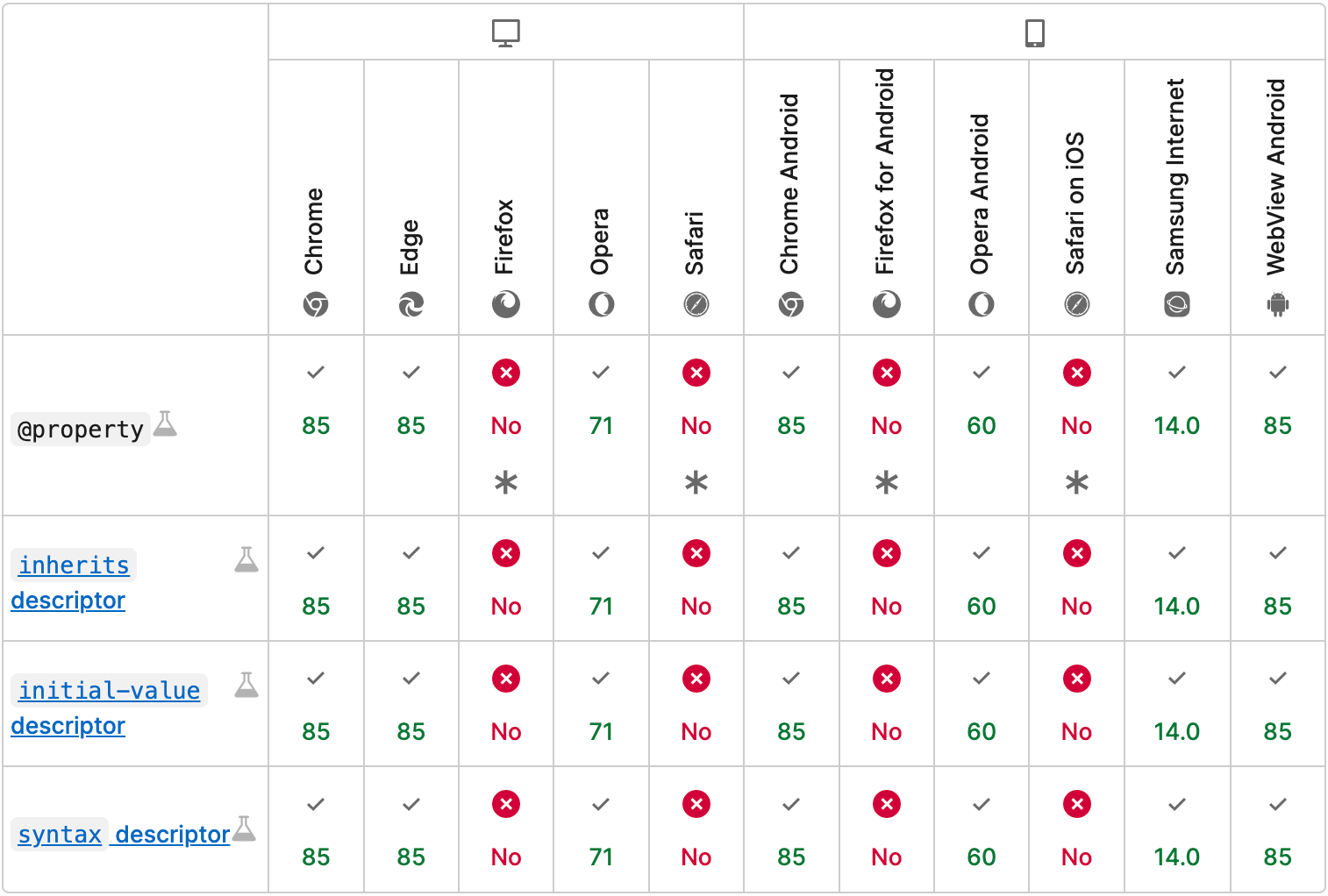
We must use @property rule to use the variable value inside the animation, but like I said previously, this way we are limited to Chromium based browsers.
Specifying CSS variables in a traditional way like --progress-value: 0 won’t work inside the animation, as per specification they are not animatable.
Browser compatibility for @property rule:

We’ll need to change the percentage value to a calc() function to calculate the percentage for the conic-gradient.
Finally, let’s animate the percentage value along with the progress bar. We will do it in a similar fashion. We’ll use existing CSS variable and set it equal to a pseudo-element counter property, as well as specify the animation property.
@property --progress-value {
  syntax: "<integer>";
  initial-value: 0;
  inherits: false;
}

@keyframes progress {
 to { --progress-value: 75; }
}

.progress-bar {
  display: flex;
  justify-content: center;
  align-items: center;

  width: 100px;
  height: 100px;
  border-radius: 50%;
  background:
    radial-gradient(closest-side, white 79%, transparent 80% 100%),
    conic-gradient(hotpink calc(var(--progress-value) * 1%), pink 0);
  animation: progress 2s 1 forwards;
}

.progress-bar::before {
  counter-reset: percentage var(--progress-value);
  content: counter(percentage) '%';
  animation: progress 2s 1 forwards;
}
Result (refresh page):
Conclusion
While pure CSS solution for circle progress bar is easy to implement it lacks additional customization. For the most part you can only control the width and color of the bar.
Another aspect of this solution, is that it’s not yet fully supported by all browsers, the animation to be exact. So if you’re considering a bulletproof way to display a circle progress bar with animation and possible customizations, you’d might want to use SVG solution.
Finally the end result with complete code can be viewed on CodePen:
See the Pen Untitled by Nikita Hlopov (@nikitahl) on CodePen.
