How to Create a Responsive YouTube Embed with Custom CSS for Adjustable Size
YouTube embeds are a great addition to a web page. In this guide, I’ll show you how to make them responsive with a sprinkle of CSS.
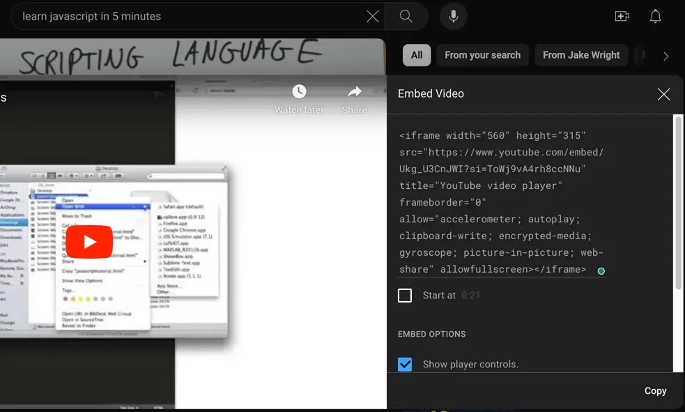
By default, YouTube provides the following HTML code for video embeds.
<iframe
  width="560"
  height="315"
  src="https://www.youtube.com/embed/Ukg_U3CnJWI?si=9aST45sr3a1mrjKJ"
  title="YouTube video player"
  frameborder="0"
  allow="accelerometer; autoplay; clipboard-write; encrypted-media; gyroscope; picture-in-picture; web-share" allowfullscreen
  >
</iframe>
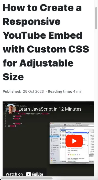
If you use the code above in your code, the YouTube video will remain at the fixed size of 560x315px no matter the viewport size.
It may look fine on larger screens but it won’t fit on smaller screens:
The problem is caused by the size attributes width and height on the iframe element.
There are a few ways how you can solve it.
1. Using the aspect-ratio property
First you need to remove the width and height attributes from the iframe and give it a custom class name e.g. yt-embed.
<iframe
  class="yt-embed"
  src="https://www.youtube.com/embed/Ukg_U3CnJWI?si=9aST45sr3a1mrjKJ"
  title="YouTube video player"
  frameborder="0"
  allow="accelerometer; autoplay; clipboard-write; encrypted-media; gyroscope; picture-in-picture; web-share" allowfullscreen
  >
</iframe>
Next you’ll need to set the aspect-ratio property for the iframe along with the 100% width.
.yt-embed {
  aspect-ratio: 16 / 9;
  width: 100%;
}
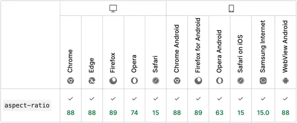
The aspect-ratio property is a modern CSS way to set the size of a container. It is supported by all modern browsers.
💡 NOTE: Today the standard video aspect ratio is 16:9 (recommended by YouTube and Vimeo).
2. Using the padding hack
If for some reason you can’t use the aspect-ratio property to make your ember responsive, you can use the so-called “padding hack”.
Using this approach you’ll need to wrap the iframe into a div element and you can leave the width and height attributes.
<div class="yt-container">
  <iframe
    class="yt-embed"
    width="560"
    height="315"
    src="https://www.youtube.com/embed/Ukg_U3CnJWI?si=9aST45sr3a1mrjKJ"
    title="YouTube video player"
    frameborder="0"
    allow="accelerometer; autoplay; clipboard-write; encrypted-media; gyroscope; picture-in-picture; web-share" allowfullscreen
    >
  </iframe>
</div>
To make it work in CSS you’ll need to set the container div to position: relative with the padding-top (for aspect ratio) and the iframe to position: absolute and 100% of the size.
.yt-container {
  position: relative;
  padding-top: 56.25%;
}

.yt-embed {
  position: absolute;
  top: 0;
  left:0;
  width: 100%;
  height: 100%;
}
Conclusion
Your go-to solution should be using the modern CSS approach with the aspect-ratio property. The code is small and straightforward.
However, the “padding hack” approach is useful if you have to deal with older browsers where the aspect-ratio property is not supported. Also, it’s good to know if you come across it in the existing code base.
You can read more about the padding hack and aspect-ratio in my detailed article.