Modal window with native HTML dialog element
HTML 5 provides a native semantic way to markup a pop-up or a modal window.
So instead of plain old div’s now you can use the new HTML5 dialog element. There are a few benefits of using a dialog tag unlike regular div:
- It is semantic thus making it more accessible;
- It has some CSS specific styling to it;
- It has a native JavaScript API.
HTML
For the HTML it is quite simple it looks as follows:
<dialog>
  <h2>Subscribe to our newsletter</h2>
  <form>
    <input type="email" placeholder="example@email.com" />
    <button type="submit" value="subscribe">Subscribe</button>
    <button class="close-modal" value="cancel">No Thanks</button>
  </form>
</dialog>
But it won’t be visible when this code is added. In order for it to appear the open attribute must be added to the dialog tag:
<dialog open>
  <h2>Subscribe to our newsletter</h2>
  <form>
    <input type="email" placeholder="example@email.com" />
    <button type="submit" value="subscribe">Subscribe</button>
    <button class="close-modal" value="cancel">No Thanks</button>
  </form>
</dialog>
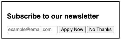
The default styling on the dialog tag with the above HTML inside:
The modal box can also be closed with HTML only. To do that a form tag has to be used inside the dialog with the method="dialog" attribute. This way the dialog will be closed once the form is submitted.
<dialog open>
  <h2>Subscribe to our newsletter</h2>
  <form method="dialog">
    <input type="email" placeholder="example@email.com" />
    <button type="submit" value="subscribe">Subscribe</button>
    <button class="close-modal" value="cancel">No Thanks</button>
  </form>
</dialog>
CSS properties
The HTML dialog tag comes with a few neat CSS features. First is the open attribute selector, which can be used to style the opened state of the element. By default, the dialog tag is set to display: none.
You can add a bit of style when opening your modal window. Here’s a fade animation:
dialog[open] {
  animation: toggle-modal .3s ease-in-out;
}

@keyframes toggle-modal {
  from {
    opacity: 0;
  }

  to {
    opacity: 1;
  }
}
To give a sense of depth to your modal box you can apply a special ::backdrop pseudo-element for the dialog tag. For instance, you can dim the screen so that the modal window stands out. Let’s set the dark transparent background:
dialog::backdrop {
  background: rgba(0, 0, 0, 0.5);
}
JavaScript API
The HTML dialog tag comes with a built-in API in JavaScript. This comes in handy to close and open it, instead of adding a class name or other ways to show/hide the HTML element.
To open or close the dialog you can use the respective methods on the selected dialog element show() and close().
const dialog = document.querySelector('dialog')

dialog.show() // will open modal
dialog.close() // will close modal
However, note that the show() method will not apply the ::backdrop pseudo-class to the dialog.
In order to open dialog with a ::backdrop use the showModal() method.
Finally, you can identify which button was used to close the dialog. Notice the value attribute added to both buttons. Use the returnValue property on the selected dialog element.
The dialog can listen to close and cancel events. We’ll use the close event to get the returnValue.
const dialog = document.querySelector('dialog')

dialog.addEventListener('close', () => {
  console.log(dialog.returnValue)
})

dialog.close()

// depending on the button clicked
// the console will log a "subscribe" or "cancel"
Result
The final result of the HTML modal window can be seen on the CodePen:
See the Pen HTML dialog element as a modal/pop-up by Nikita Hlopov (@nikitahl) on CodePen.
Accessibility
Not only this element is semantically correct, but it also performs better in terms of accessibility.
First thing is that it captures focus on open, you can spot that in the example result above. So no need to write additional code for that.
Also the dialog can be closed using esc key. Again no need to write additional code here.
When investigating this topic I’ve stumbled upon a great article that covers creating accessible modal dialogs for desktop and mobile. It shows a detailed step-by-step guide which I recommend you to check out as well.
Browser Support
The browser support for dialog is not full at the moment this article is published. Only the latest versions of Chrome-based browsers support this tag such as Chrome, Edge, Opera, Brave, and mobile Chrome.
Polyfill
However, a polyfill exists that works both on Safari and FireFox. The GitHub repo made by Google Chrome with the setup guide and usage:
https://github.com/GoogleChrome/dialog-polyfill
As well as the Demo which you can check out on non supported browsers: