Creating stylish number input with custom buttons
By default, the appearance of the number input is not very user-friendly, particularly the arrows. In this article, I will demonstrate how you can customize it to make it more appealing and easier to use.
Contents:
Hide default arrows
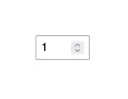
The default number input arrows are often considered suboptimal because of their unappealing design and limited usability, making them less intuitive and user-friendly for individuals interacting with the input field.
Not to mention the lack of consistency accross different browsers. The arrows will appear on hover.


To hide the default arrows, you’ll need to use the ::-webkit-outer-spin-button and ::-webkit-inner-spin-button pseuso-elements.
These will only work for the WebKit or Blink based browsers. To hide the arrows on Firefox, you’ll need to use the vendor prefixed appearance property with a value of textfield on the number input.
/* WebKit and Blink */
input::-webkit-outer-spin-button,
input::-webkit-inner-spin-button {
  -webkit-appearance: none;
  margin: 0;
}

/* Firefox */
input[type="number"] {
  -moz-appearance: textfield;
}
Add custom buttons
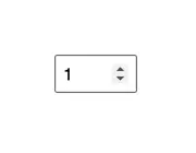
Now that the default arrows are hidden, we can add buttons that will act as increment and decrement controls for the number input.
Usually, what you will see is the decrement button on the left side of the input and the increment button on the right side of the input. This is how I’m going to do it as well; however, you can position the buttons any way you like.
<button
  class="value-control"
  onclick="numberInput.stepDown()"
  title="Decrease value"
  aria-label="Decrease value">-</button>

<input
  class="value-input"
  type="number"
  value="1"
  name="numberInput"
  id="numberInput">

<button
  class="value-control"
  onclick="numberInput.stepUp()"
  title="Increase value"
  aria-label="Increase value">+</button>
Explanation:
For each button, we will include a title attribute to signify the action of the button. Additionally, we will add an aria-label attribute to enhance accessibility for assistive technologies.
The decrease button will feature a “-“ symbol, while the increase button will showcase a “+” symbol.
Finally, the buttons will have an onclick attribute that will modify the number input value. This attribute will reference the id attribute of the number input, which is available in the global scope, along with a corresponding method to either increase (stepUp()) or decrease (stepDown()) the value.
Styling the input
Finally, let’s add some styles to the buttons and input.
I’ll define CSS variables to maintain consistency in properties such as border, border-radius, height and font-size.
In the end, I’ll apply pseudo-classes (focus, hover and active) for an improved UI and enhanced accessibility.
:root {
  --border-radius: 3px;
  --border: 2px solid #3b3b3b;
  --control-size: 38px;
  --font-size: 20px;
}

.value-control {
  width: var(--control-size);
  height: var(--control-size);
  margin: 0 8px;
  background: transparent;
  border: var(--border);
  border-radius: var(--border-radius);
  color: #3b3b3b;
  cursor: pointer;
  font-size: var(--font-size);
}

.value-control:hover {
  background: #eee;
}

.value-control:active {
  background: #ddd;
}

.value-control:focus,
.value-input:focus {
  outline: 2px solid #3e67fd;
  outline-offset: 1px
}

.value-input {
  margin: 0;
  height: var(--control-size);
  width: 80px;
  border: var(--border);
  border-radius: var(--border-radius);
  padding: 2px 8px;
  text-align: center;
  font-size: var(--font-size);
}

.value-input:hover {
  border-color: #777;
}
Demo
The final result will be a more appealing presentation of the numeric value, offering an improved method for users to modify it either through the input itself or the more distinct and larger buttons.
You can find a full demo with a complete code examples on my CodePen:
See the Pen Custom number input by Nikita Hlopov (@nikitahl) on CodePen.