Create a search icon inside input box with HTML and CSS
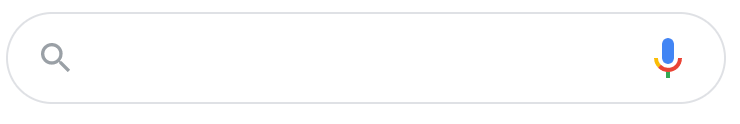
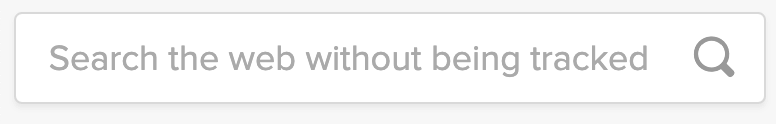
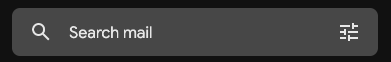
Displaying a search icon inside an input box is a nice way to indicate to the user that it is indeed a search input.


Markup
The HTML for our search box with an icon will consist of a form, input, and button elements.
<form>
  <input type="search" placeholder="Search...">
  <button type="submit">Search</button>
</form>
The form will act as a wrapper, as well as will react to the submit event.
The input element should have a type attribute equal to the search value. It will ensure a better usability on mobile devices. The keyboard with a layout suited for search will be shown.
💡 NOTE: To improve UX you can also specify an input placeholder e.g. "Search…". This will give a user an additional hint that this is indeed a search input.
Finally, the button type attribute should have a submit value. The proper button type will ensure the form can be submitted via button click without additional events for this button. The button will also act as an icon.
Styling
First, we’ll need to set the form element display property value to flex. This will allow us to properly align input and button elements.
We’ll also set a border property to wrap elements closer together.
form {
  color: #555;
  display: flex;
  padding: 2px;
  border: 1px solid currentColor;
  border-radius: 5px;
}
Next, we need to set styles for our search input box. It should span the full width of the container element, as well as have some visually appealing properties.
input[type="search"] {
  border: none;
  background: transparent;
  margin: 0;
  padding: 7px 8px;
  font-size: 14px;
  color: inherit;
  border: 1px solid transparent;
  border-radius: inherit;
}

input[type="search"]::placeholder {
  color: #bbb;
}
Finally, let’s add some styling to the submit button. We will hide the text of the button with text-indent and overflow properties, and display in its place a magnifying glass icon.
To display the icon we can use encoded svg as a background image.
button[type="submit"] {
  text-indent: -999px;
  overflow: hidden;
  width: 40px;
  padding: 0;
  margin: 0;
  border: 1px solid transparent;
  border-radius: inherit;
  background: transparent url("data:image/svg+xml,%3Csvg xmlns='http://www.w3.org/2000/svg' width='16' height='16' class='bi bi-search' viewBox='0 0 16 16'%3E%3Cpath d='M11.742 10.344a6.5 6.5 0 1 0-1.397 1.398h-.001c.03.04.062.078.098.115l3.85 3.85a1 1 0 0 0 1.415-1.414l-3.85-3.85a1.007 1.007 0 0 0-.115-.1zM12 6.5a5.5 5.5 0 1 1-11 0 5.5 5.5 0 0 1 11 0z'%3E%3C/path%3E%3C/svg%3E") no-repeat center;
  cursor: pointer;
  opacity: 0.7;
}

button[type="submit"]:hover {
  opacity: 1;
}
The last touch is to set the :focus state on input and button elements:
button[type="submit"]:focus,
input[type="search"]:focus {
  box-shadow: 0 0 3px 0 #1183d6;
  border-color: #1183d6;
  outline: none;
}
💡 NOTE: Since it's a search input, you might want to display a clear button as well.
No button example
If you’re willing to show an icon inside an input without it being a button, just remove the submit button from the form.
<form class="nosubmit">
  <input class="nosubmit" type="search" placeholder="Search...">
</form>
You can leave existing form and input styles but in this case, set the icon as a background for the input.
form.nosubmit {
  border: none;
  padding: 0;
}

input.nosubmit {
  width: 260px;
  border: 1px solid #555;
  display: block;
  padding: 9px 4px 9px 40px;
  background: transparent url("data:image/svg+xml,%3Csvg xmlns='http://www.w3.org/2000/svg' width='16' height='16' class='bi bi-search' viewBox='0 0 16 16'%3E%3Cpath d='M11.742 10.344a6.5 6.5 0 1 0-1.397 1.398h-.001c.03.04.062.078.098.115l3.85 3.85a1 1 0 0 0 1.415-1.414l-3.85-3.85a1.007 1.007 0 0 0-.115-.1zM12 6.5a5.5 5.5 0 1 1-11 0 5.5 5.5 0 0 1 11 0z'%3E%3C/path%3E%3C/svg%3E") no-repeat 13px center;
}
Demo
You can find a full demo with a complete code examples on my CodePen:
See the Pen Untitled by Tippingpoint Dev (@tippingpointdev) on CodePen.